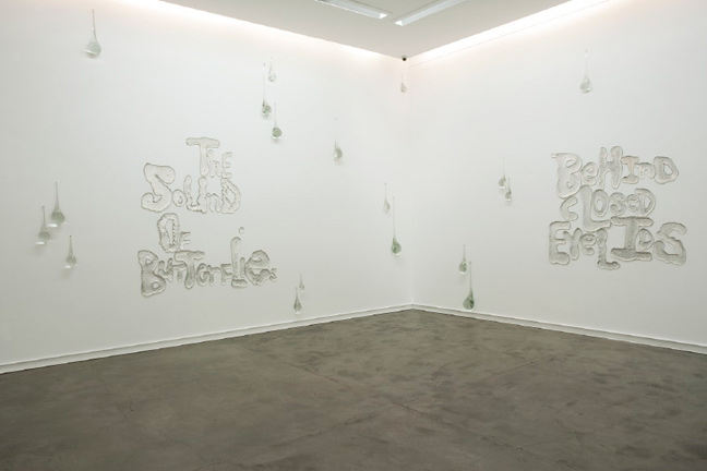
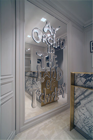
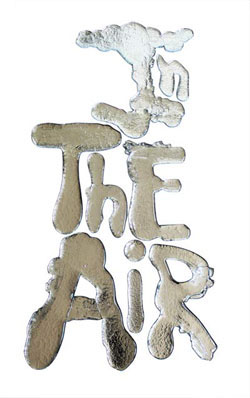
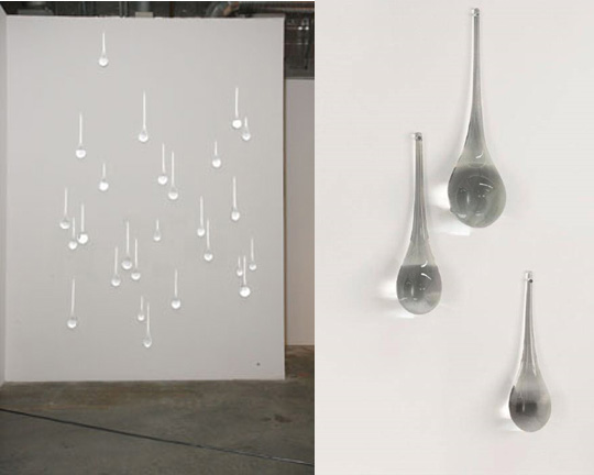
I stumbled upon Rob Wynne glass art installations and was immediately blown away. Besides the incredible sense of humor, it possesses such a captivating dimensionality and makes you stop and stare. “Teardrops” stole my heart.


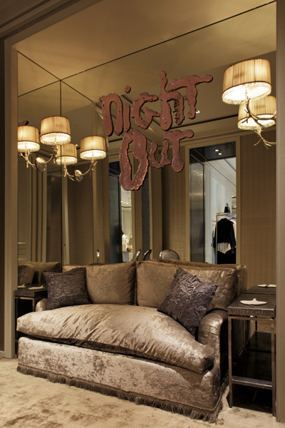
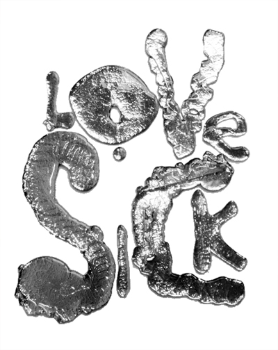
My another favorite is poured and mirrored glass text. My designer juices are boiling with ideas for its application.


<images via www.robwynne.net, also here and here>
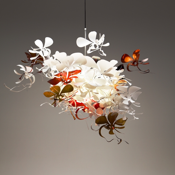
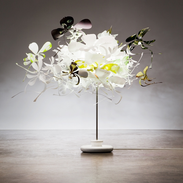
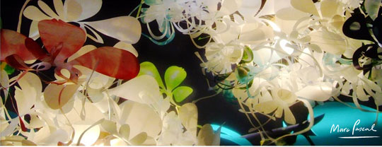
This lovely and whimsical light fixture by Australian artist Marc Pascall is so uplifting and fun. The poly carbonate orchid flower are hand-dyed by the master in multiple colorways. Available through Tabula Tua here.


 <images via here and here>
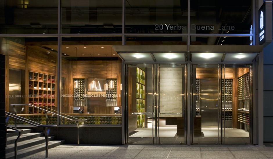
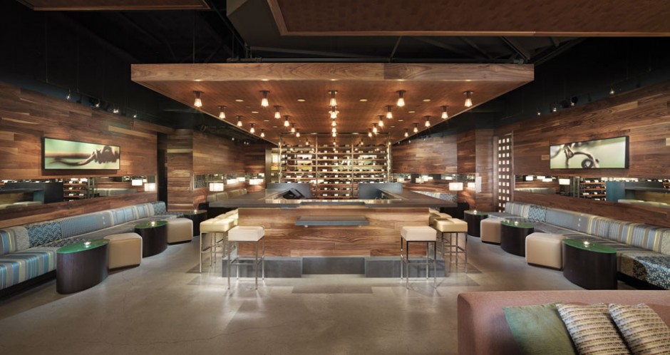
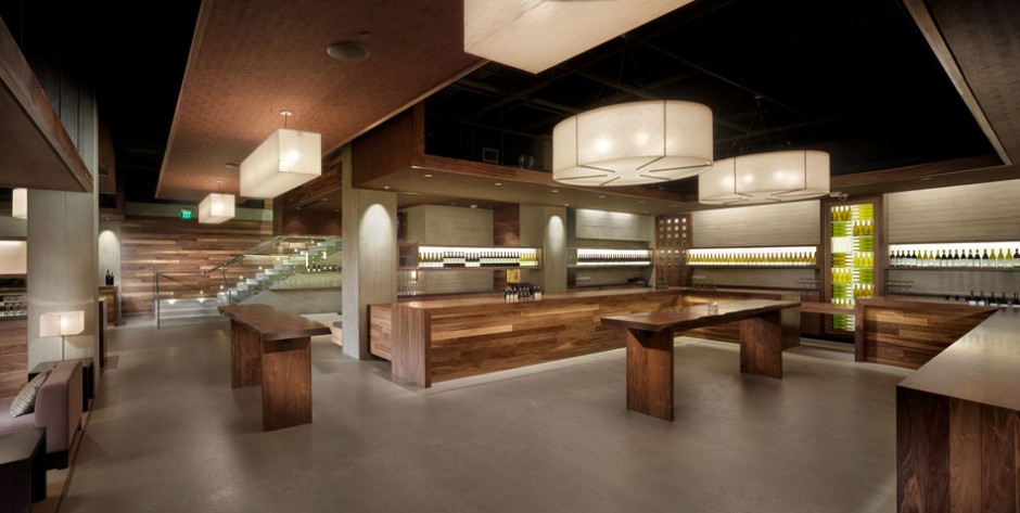
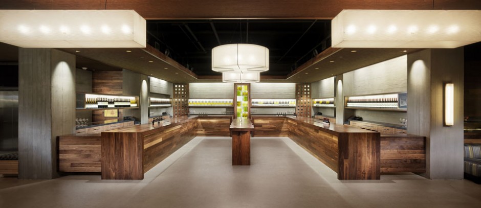
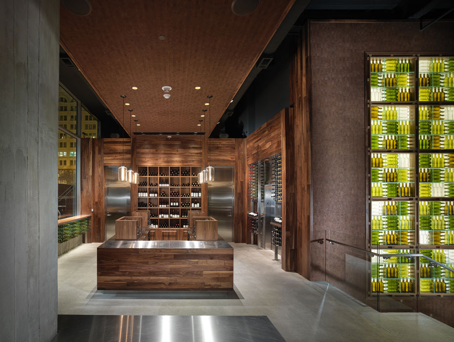
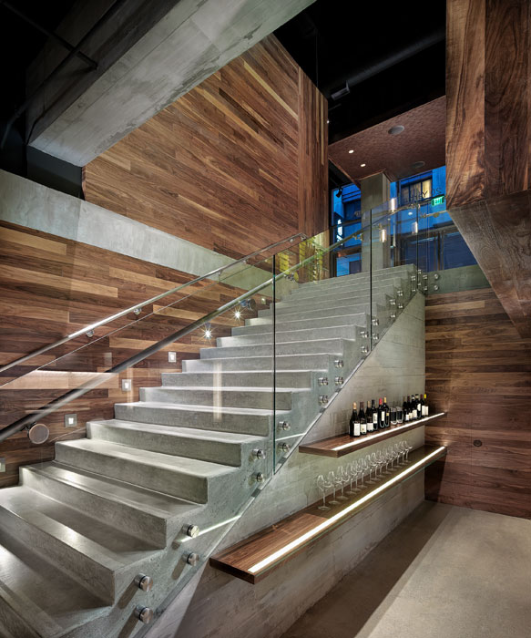
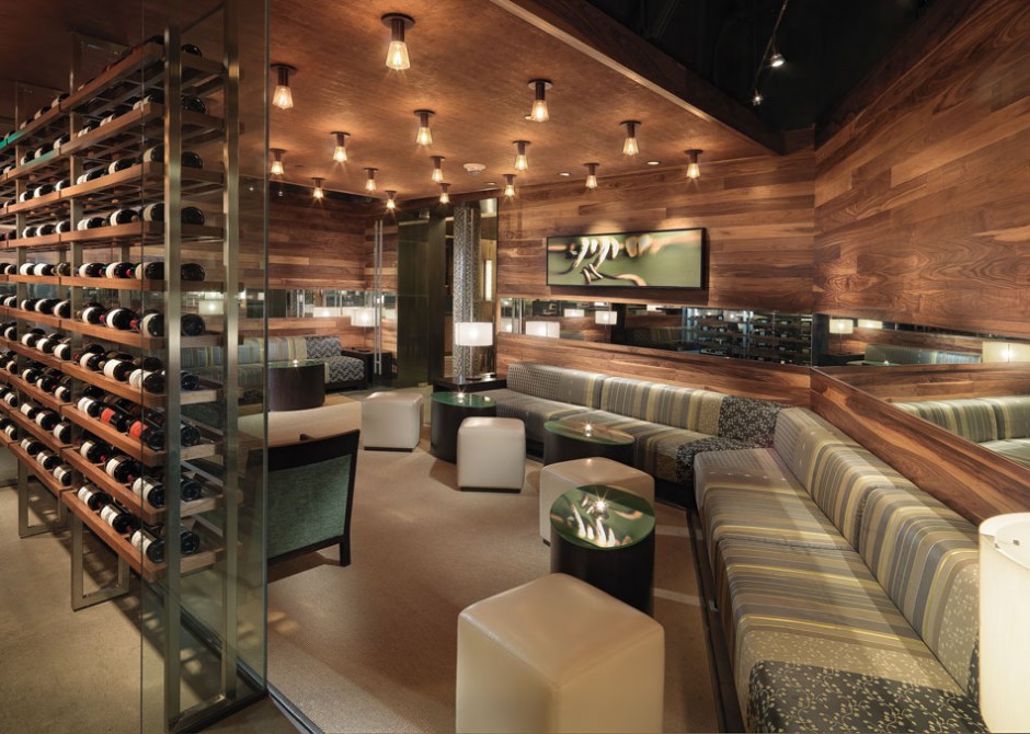
Warm autumn days makes me what to put my boots on and visit the countryside. So it happens that in California the countryside is most likely to include a winery or two. I love little wineries with their perfect design simplicity, stained rustic wood and succinct decor (mostly including wine bottles only). When I came across The Press Club, San Francisco wine tasting room and shop, I gasped at how ideally BCV Architects translated all that we love about country wine tasting into urban surrounding.
Perfect Recipe:
Laconic Architecture – check
Wood (lots of wood) – check
Bottle Decor – CHECK!


The 9,000 sf venue is located within San Francisco’s Four Seasons hotel on Yerba Buena Lane. The 1,100 SF entry level shop entices the visitor inside, and then reveals a grand stair to a subterranean level tasting lounge. The palette of materials mixes warm, sustainably sourced woods with exposed structural elements, suggesting the partnership of the organic and the industrial that is the hallmark of Wine Country. Wine bottles themselves are used in innovative displays that bring color and light to the space.


 <images via www.contemporist.com>
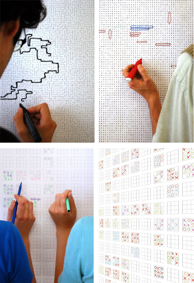
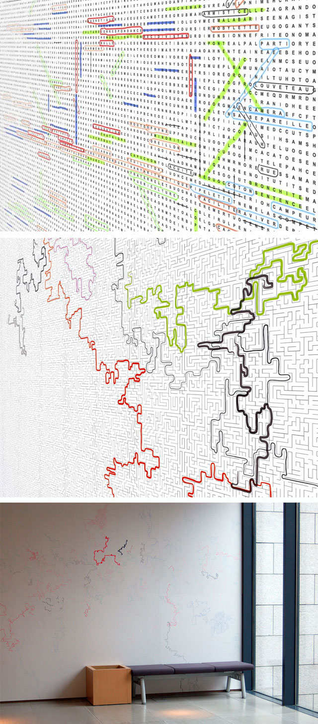
As I’m on my continuous streak of studying for my Thesis, it’s all work and no play here. But how fun would it be to be surrounded by play. Literary! With the Games Wallpapers from Parisian design group 5.5 Designers any room can become playground.

Can you imagine how perfect it is for the boring dentist waiting rooms or kids’ rooms! So engaging!  <images via www.cinqcinqdesigners.com>
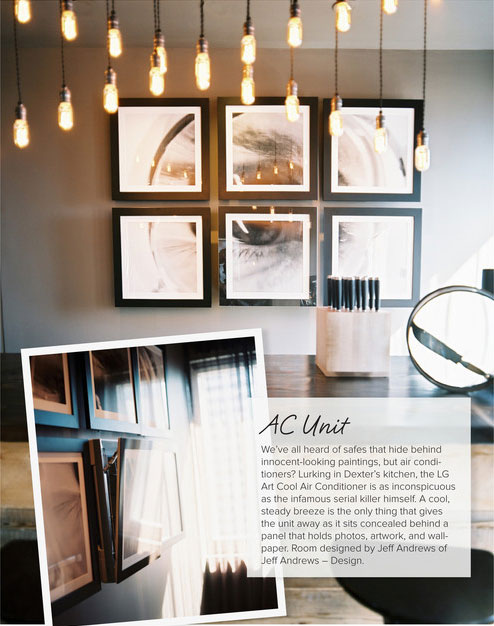
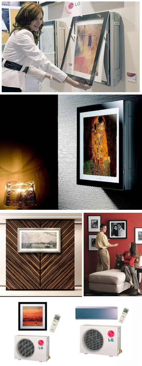
Flipping through the pages of the latest Lonny mag, I came across this miraculous technological solution for the jaded problem of all designers – how to hide the AC. Genius LG developed the new series of AC/Heat Pumps split system called Art Cool, so that the whole unit is hidden behind your favorite print or art. Genius!
Check out Art Cool in Dexter’s kitchen designed by Jeff Andrews.
Anyone had any experience with this gizmo? I’m dieing to hear reviews/comments?
 <images via here, here and here>
