concetto by ceasar stone 3 June, 2010

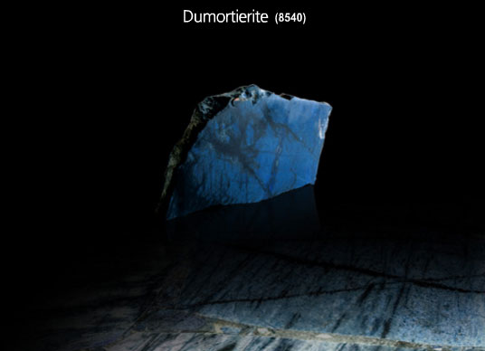
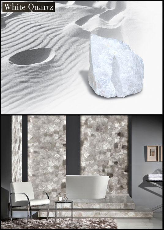
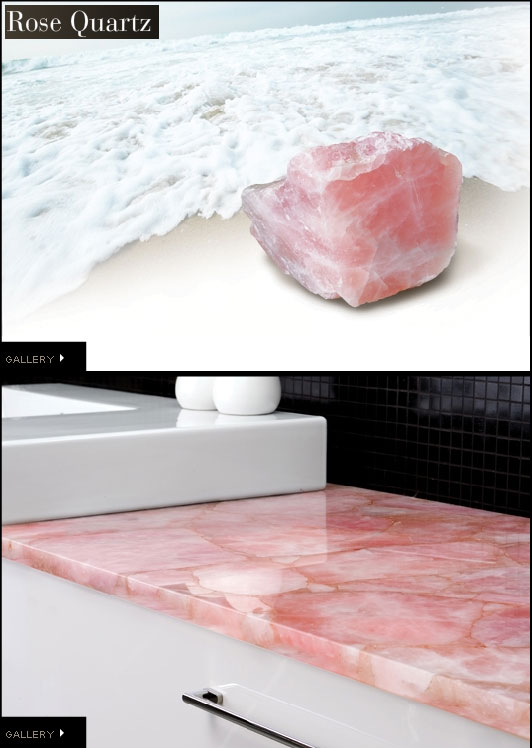
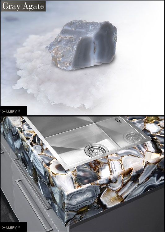
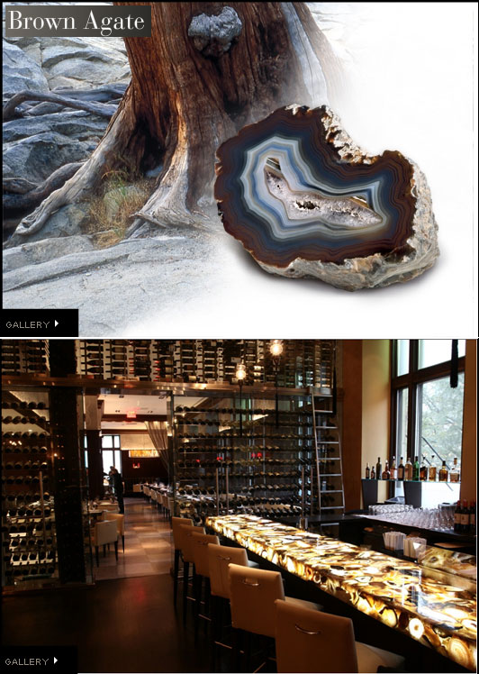
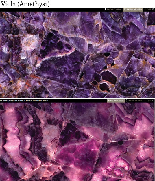
From a movie jewel to the real jewels. Concetto is a new awe-inspiring collection of extraordinary surfaces hand-made from individually cut and bound semi-precious stones by CeasarStone. The incredible natural patterns and hues are combined with heat, stain and scratch resistance qualities. With 19 varieties and an option for back-lighting, you are in for a real treat.

<images via www.concettous.com>

i’ve been cheating on fashion with furniture 28 May, 2010

This is exactly how I’m feeling for the past several years and now that someone has said it out loud, it makes it even more real than ever.  Although there’s one thing that brings me back to fashion like no other. It’s Sex and the City. Buying a ticket 2 weeks in advance secured a spot for the yesterday’s opening night. And to be honest, I’ve never seen that many Louboutins in a movie theater: girls did dress up.  As for the movie, I’m not a movie spoiler and won’t open any secrets, just say despite the elevated controversy with the story line, the visuals didn’t fail to amaze and indulge both fashion and interior addicts.

The razzle-dazzle color pallets are just what doctor prescribed for the summer: golds, emeralds, sapphires, rubies and did I say GOLD? Lavish Middle East in all its beauty.
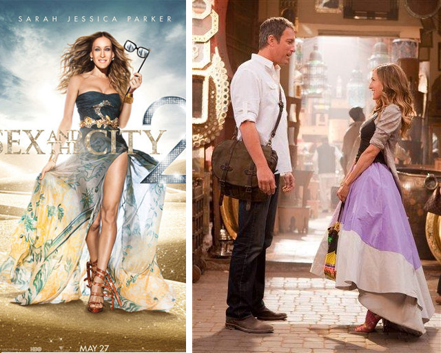
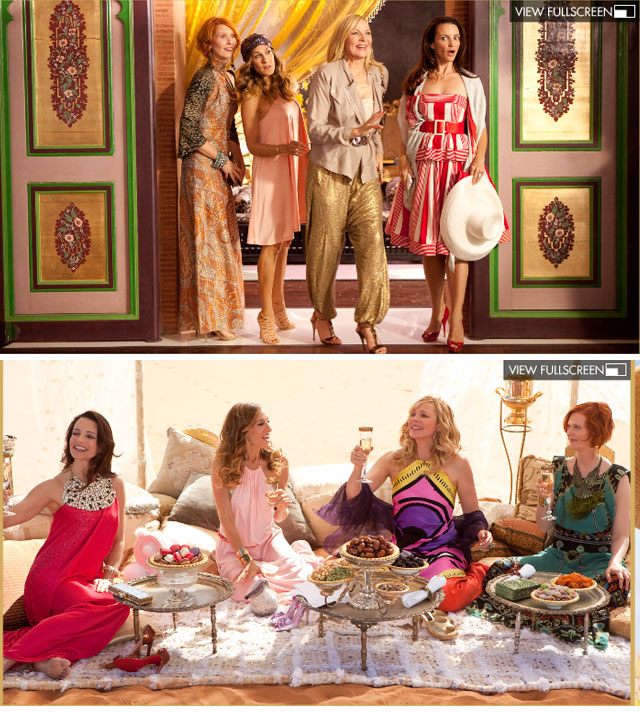
Thanks to Jeremy Conway, the production designer for the TV series and both films, along with set decorator Lydia Marks of Marks & Frantz we have a new interiors word to be smitten by. I loved to trace the interplay of feminine and masculine in the Carry and Big’s new apartment.
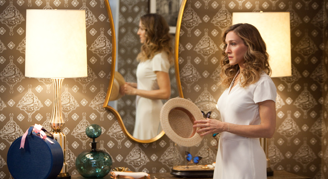
A blown-glass chandelier by Lindsey Adelman Studio is a showstopper in Carrie and Big’s hallway.
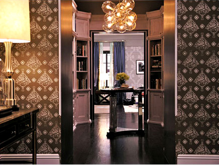
Carrie and Big’s living room includes a sofa by Montauk Sofa upholstered in blue wool-mohair from Donghia and a pair of beige midcentury side chairs. The bright floral Birdie Blossom Cushion by Paul Smith for the Rug Company adds a classic “Carrie” touch.
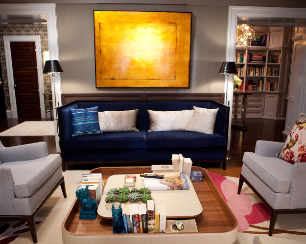
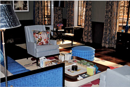
In the dining room, an oxidized-metal chandelier by Property hangs above a French 1940s mahogany table from Alan Moss. The custom-made chairs were upholstered in a Lee Jofa print fabric.
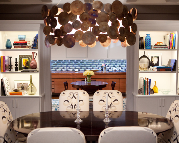
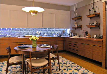
Recognizing that Carrie wouldn’t cook, Conway designed the kitchen and dining area of the couple’s home with Mr. Big in mind by including such modern touches as aqua-blue tiles from Ann Sacks installed on the kitchen walls.
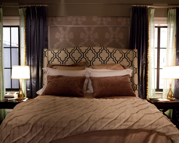
Carrie and Big’s bedroom is a striking blend of pattern and texture. The custom-headboard is covered in fabric by Kravet and pops against the neutral Rococo Stripe wallpaper by by Cole & Son from Lee Jofa.
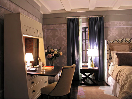
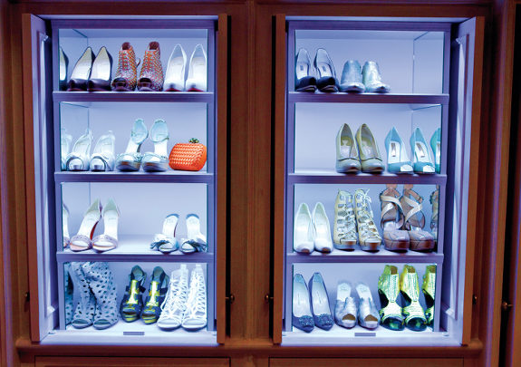
And of course, the closet. Although more subdued than the flashy mega boutique of the first movie, it’s very functional and grown up.
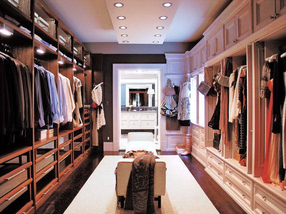
<Images via www.marksandfrantz.com and www.sexandthecitymovie.com

images and source references via www.elledecor.com >
walking in residential sacramento 26 May, 2010

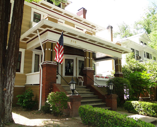
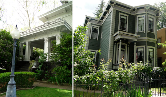
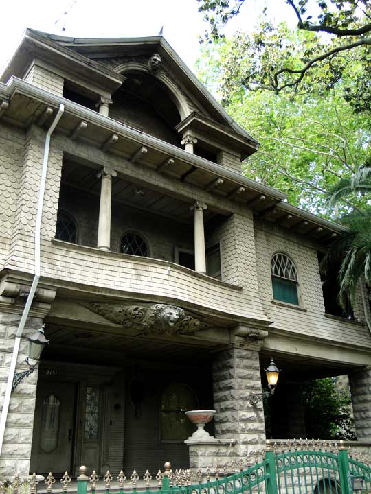
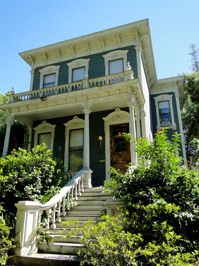
For me the best part of Sacramento is its residential part. Rarely I see such a perfect combination of beautiful architecture dawning in greenery and a peaceful atmosphere.

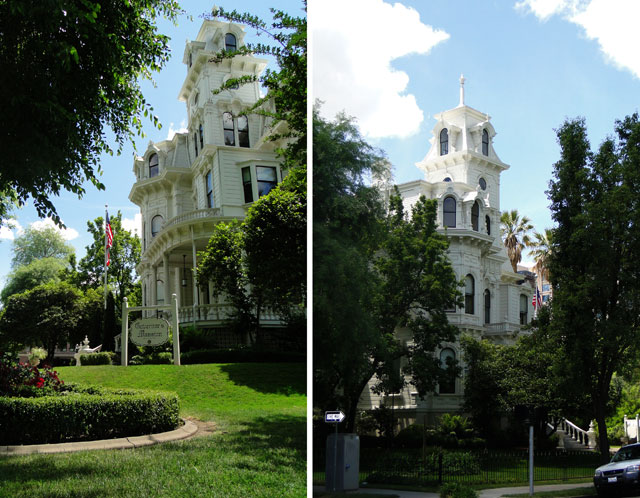
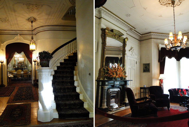
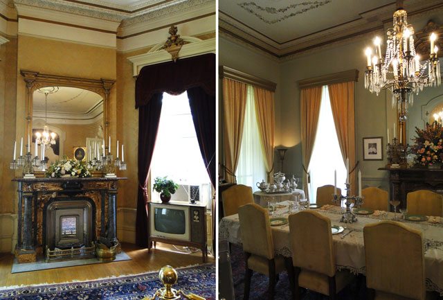
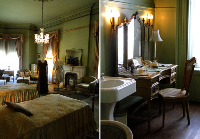
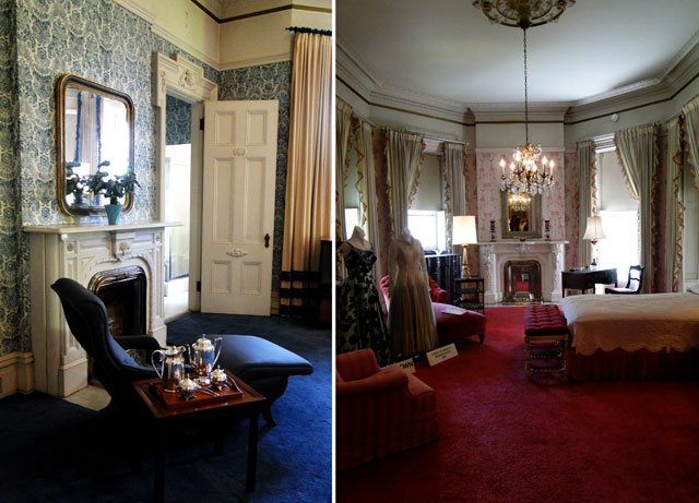
I started my trip with the tour of the Governor’s Mansion. With the rich history behind, the place is like a time machine where you can see the transfer of style from Victorian to the 50s turquoise kitchen. 

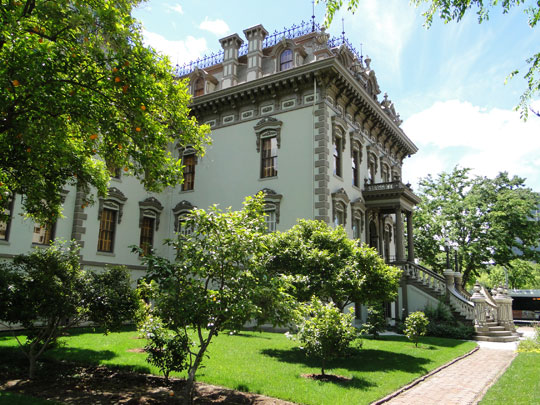
Leland Stanford Mansion was just as impressive if not more. Unfortunately no photography is allowed inside. 

As for the mere mortals, they have nothing to complain about. The regular streets are full of old charms.

<images via me>
walking in downtown sacramento 26 May, 2010

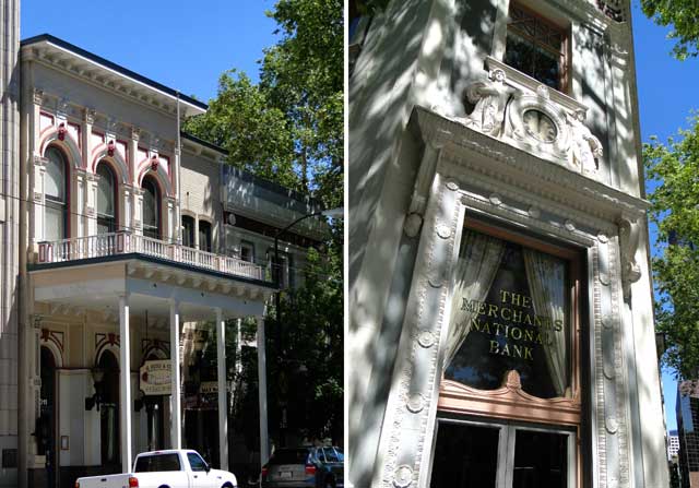
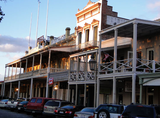
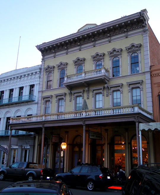
Being a soccer wife does have some benefits. Besides witnessing games’ highlights live, every now and then we get the unplanned road trips. So last weekend we went to Sacramento (hence the lack of posts). Surprisingly small town (for the capital of California), it possesses such an irresistible charm that I couldn’t help but snuck out in between the games to just walk the streets and take it all in.

Sacramento’s architecture is a clad of Victorian, Colonial, American Federalist, Greek and all sorts of Classical Revivals. Yum! Needless to say that my whole historical entity was having a blast.

Capitol Building (1861 – 1874)

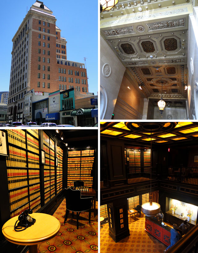
California Western Life Building (now Citizen Hotel) – 1925

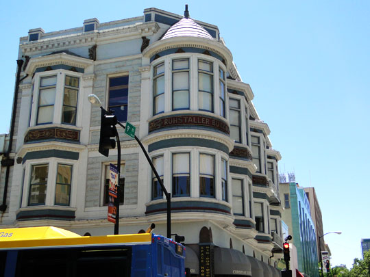
Ruhstaller Building – 1898

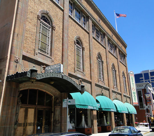
Masonic Temple – 1920

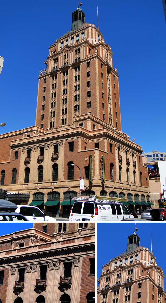
Elk Building – 1926

Pioneer Hall – 1868 and Merchant National Bank – 1921

Old Sacramento

<images via me>

old never dies 20 May, 2010

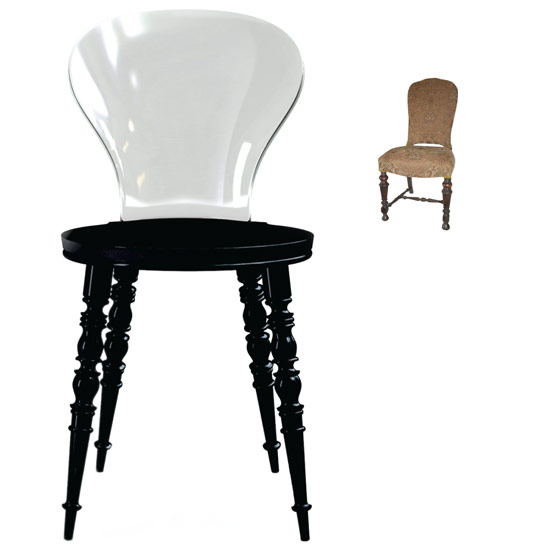
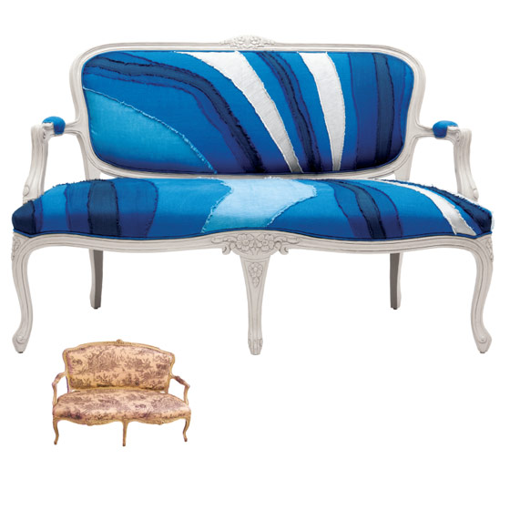
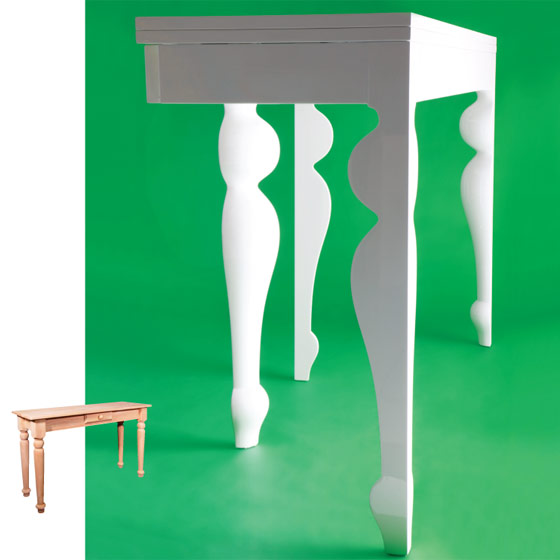
In proof my “perpetual historicity of the design” theory, I came across this article in NY Mag. NeoVictorian, NeoVersailles, NeoCountry…everything old is new again. It’s just a circle of life, which means that quality vintage will never go out of style. Transformed, reinvented, repurposed, reupholstered but it WILL go on. Make it a new investment.

Babel chair by Dutch design phenom Marcel Wanders ($530 at xo-design.com; available in late 2010).

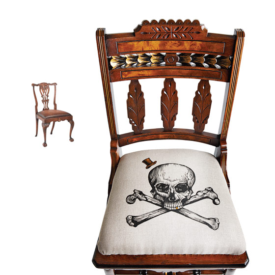
Vintage chair with painted linen seat by Caitlin Conlow ($375 at Funkiture).

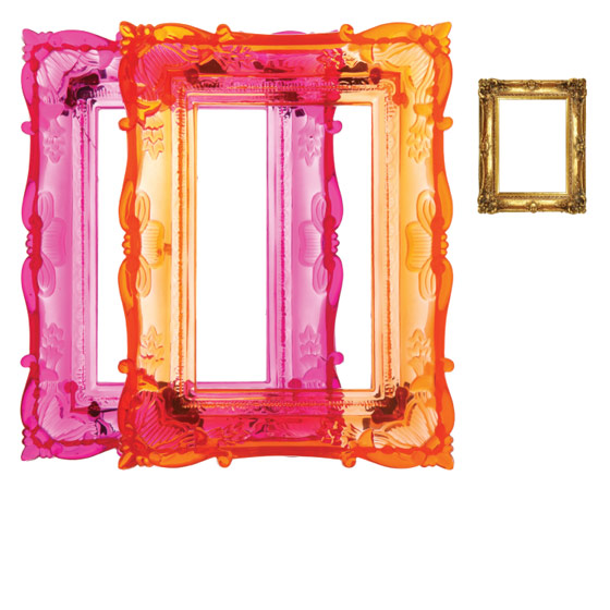
Baroque-style frames in translucent plastic ($12.95 at Site)

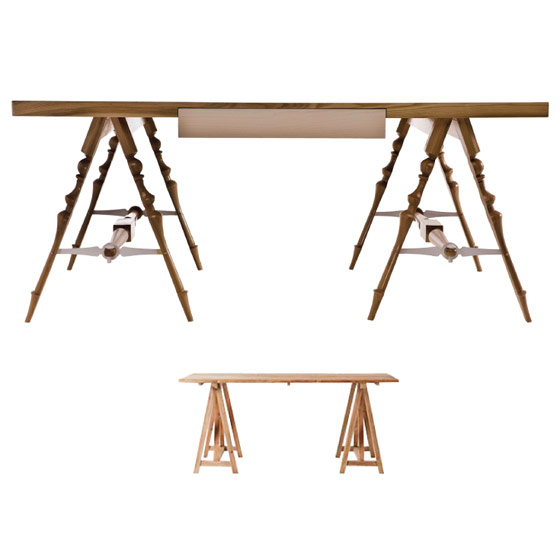
Sawhorse-leg table made of oak and powder-coated steel by South African design team Egg ($5,800 at Amaridian).

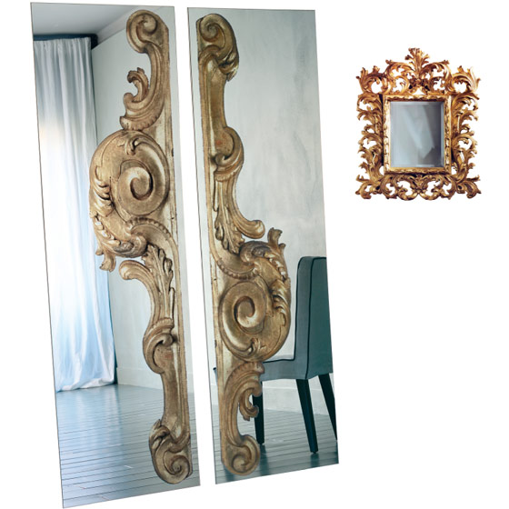
Bollywood mirror with digitally printed designs by Paola Navone ($2,690 at Property)

Customizable brass hanging candelabra by Lindsey Adelman ($4,800 at Matter).
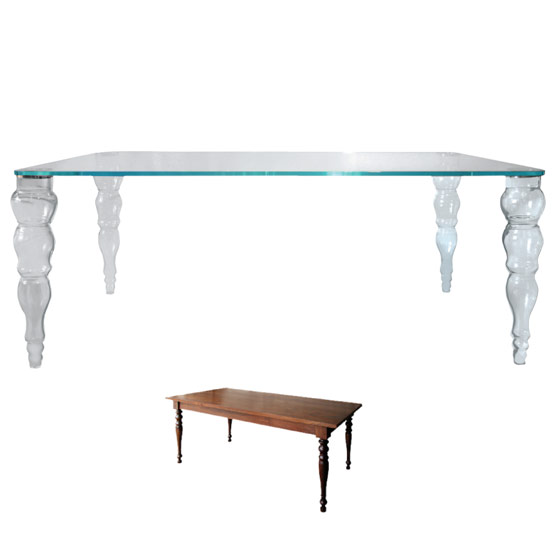
Glass table with turned-column legs ($7,995 at ABC Carpet & Home).
Louisa settee with ragged cotton-and-linen upholstery ($2,498 at Anthropologie).
Acrylic Julius Caesar mini-bust by Jeffrey Harris ($30 at Hadley Antiques)
White lacquered-wood table by Romani Saccani ($4,200 at Property)
<images via www.nymag.com>