residential

farrow and ball wallpapers 17 May, 2010

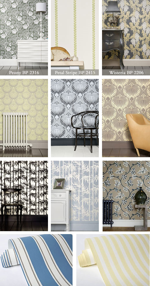
It seems like the aftermath of the Legends of La Cienega will feed my blog posts for quite a while now. But with my weakness for all sorts of wallcoverings, I couldn’t not to write about the fabulous Farrow and Ball, a European paint and wallpaper company. Large variety and colorways, generous samples size but what really made me stand and stare is the quality. The printing techniques allow the paint to have the textured vintage, almost nostalgic, feel as if every ornament was pressed in by hand. A truly European quality.

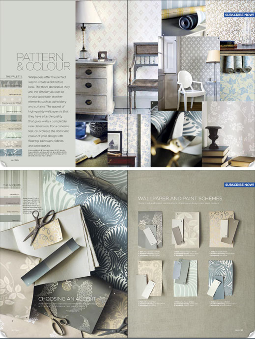
Don’t know where to start? Or, like me, getting lost in too many irresistible choices? flip through online inspiration magazines “Key Looks with Color”  and “Feel Good Rooms” by Homes and Gardens with association with Farrow and Ball.

<images via www.farrow-ball.com>
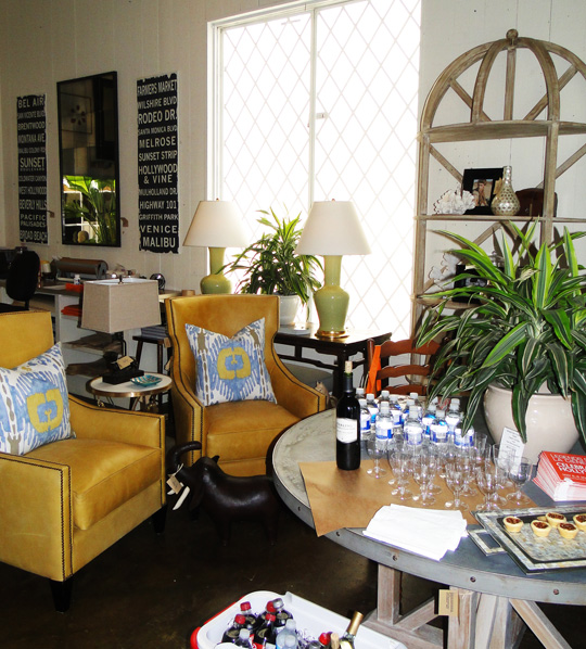
mecox on la cienega 13 May, 2010

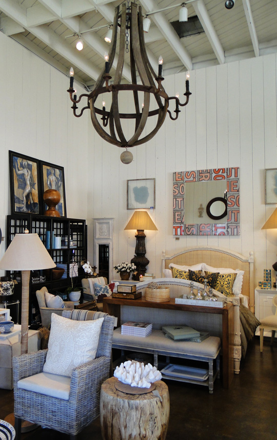
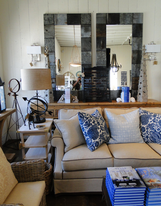
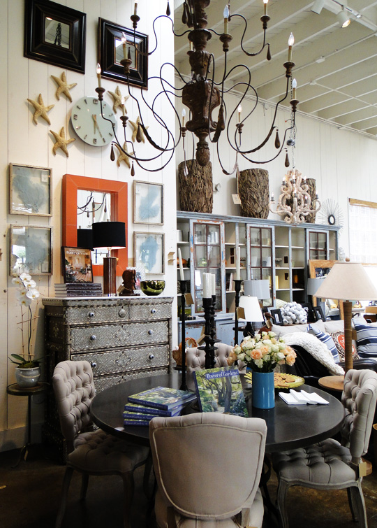
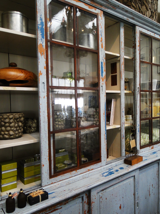
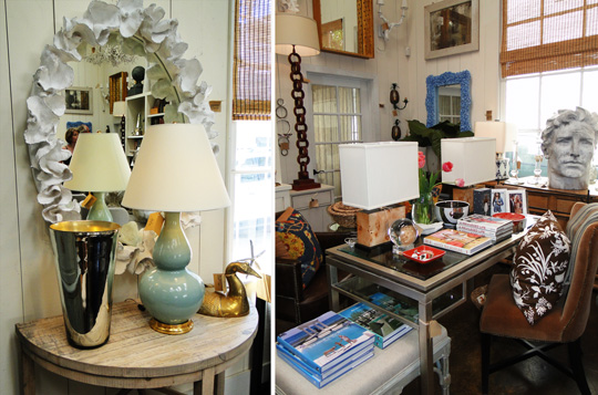
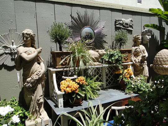
I’m sure anyone of you have ever felt at home when entering a furniture showroom. Well, I just discovered my furniture heaven last weekend. Even though my personal style changes pretty often, Mecox is the representation of everything ME this summer from the accessories, to the books, to the dog. The only thing missing is the ocean view.

Relaxed yet sophisticated, pared-down yet intellectual… I know which site I’ll be checking quite often.

<images via me>

design fix: wall stripes 29 April, 2010

As promised I’m reviling one more DIY transformation of my apartment for the latest party weekend.  As a regular married couple we also have the TV discussions. And although we haven’t bought it yet (it’s been a year now!), the question of where to place it has been raised several times. Of course, my husband wants to put it on the pedestal in the most prominent place in the room and to be honest, we don’t have that much choice. So my challenge was how to visually divert the eye from this monster in the room and have the TV to be the last thing people will notice. I needed a statement!

So here what I came  up with.

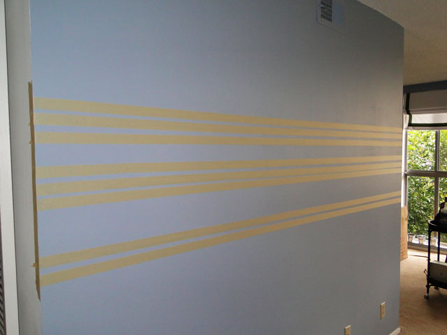
BEFORE: Regular white rental wall got painted in “Russian Blue”. Yes, I’ve selected the color by its name:)

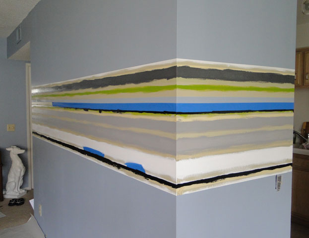
Then I taped off irregular width stripes and primed the surface of the stripes with Acrylic Medium Gel, that way the edges come out very crisp and precise.

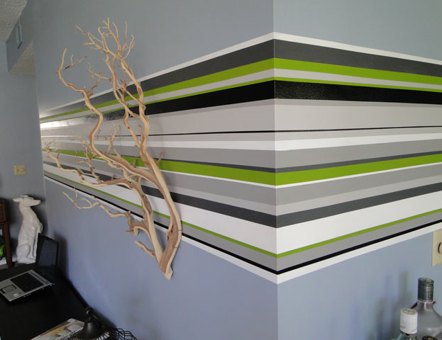
The fun part began. I used white, green, black and 3 tones of gray, all of which are left overs from previous projects.

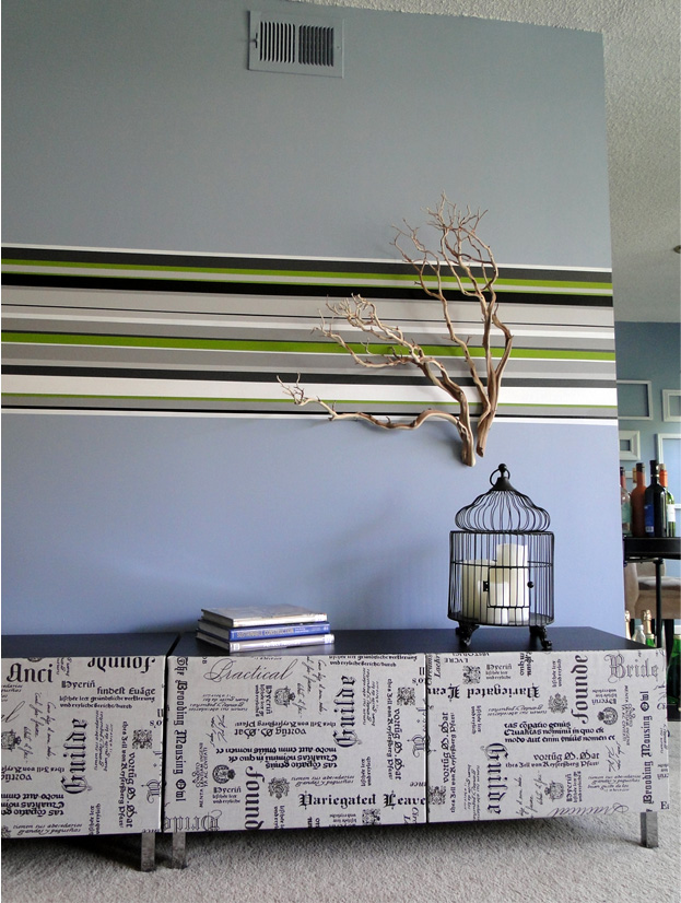
After 2 days of re-taping, re-priming and painting again, the result was quite a statement which I was looking for. I bought two Manzanita Branches and nailed them to bring in the element of nature.

As for the rest, I got two TV stands form Ikea (yes, I know… designers use Ikea too) and upholstered the doors in this amazing linen with printed fonts. I was looking for this fabric everywhere and finally found it in F&S Fabrics (Thanks Maison 21). Now, as the set is done, I’m ready for the arrival of the TV in our house.

<images via me>

white bedrooms 18 April, 2010

Living in a rental creates a lot of design challenges. Basically, you are stuck with the white walls, beige carpet and no architectural interest whatsoever. And even though our manager was kind enough to let me paint whatever I want, after tackling the living room the idea of repainting the whole apartment back to the lovely “Swiss white” doesn’t seems as exciting anymore. And I just happen to love bold dark colors, so I’m afraid I might need more than one coat of white when we move out.

And my husband, being genius as usual, suggested it to be my “Designer Challenge”. Literary white room. And while I don’t mind white rooms in certain cases, the problem is that’s the bedroom, the room that should be sumptuous and intimate.

I decided to start searching for bedrooms that can inspire.

to be continued…

<images via www.decorpad.com>

gerard butler’s new york loft 16 April, 2010

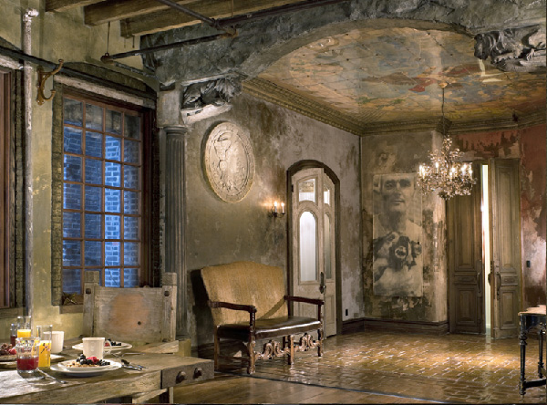
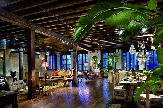
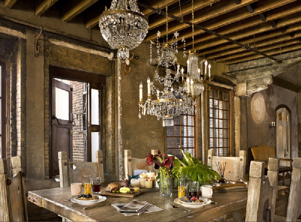
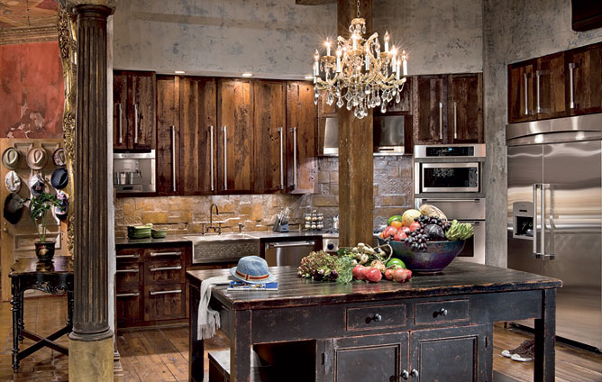
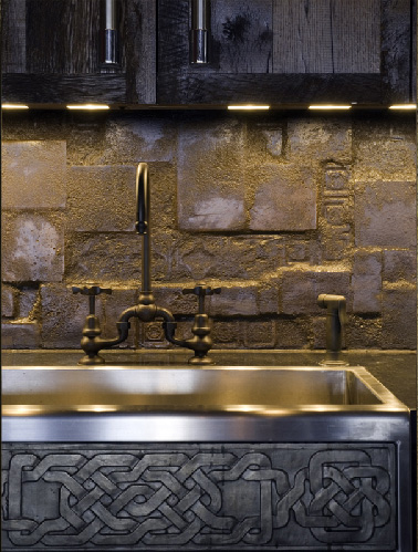
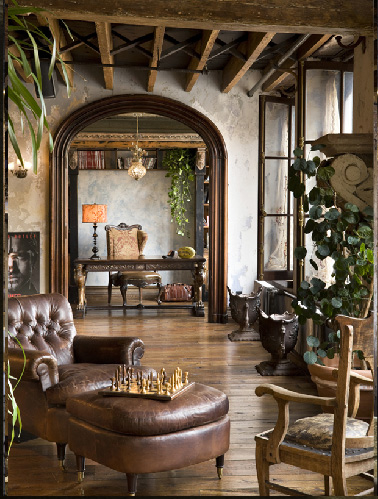
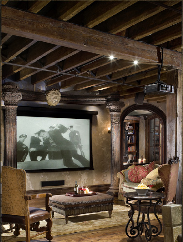
Am I the only one at ahhh with Gerard Butler’s New York Loft. I’m even ready to forgive him the Bounty Hunter. (Seriously, Gerry, don’t sell yourself cheap). But this apartment, if you can call it that, is definitely worthy of the  King Leonidas. And may be it’s not completely my cup of tea design wise, I can appreciate the quality “aged” work that so often goes sour Disneyland.

So we are talking about 3,300-square-foot loft in Chelsea, Manhattan located on 6 and 7 floors. the actor  worked with architect Alexander Gorlin and film designer Elvis Restaino for years to complete the masterpiece, and for me the time was well spent as the place looks like it’s been there forever.

According to AD, the loft boasts, “13-foot-tall mahogany doors; a ceiling and wall frescos; plaster walls chipped and mottled with age; massive columns supporting limestone lions; crystal chandeliers casting spidery shadows,” and plenty of furnishings from New York décor mecca ABC Carpet & Home.

<images via here and here>