inspiration

gerard butler’s new york loft 16 April, 2010

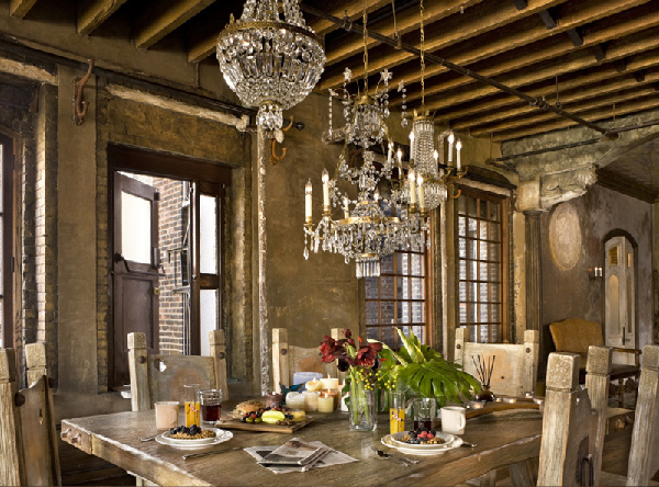
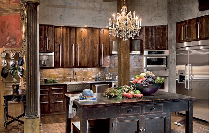
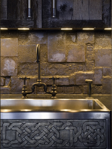
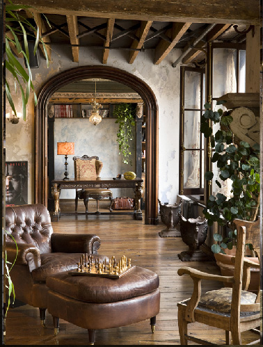
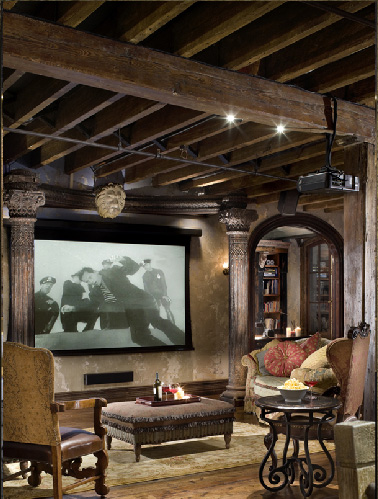
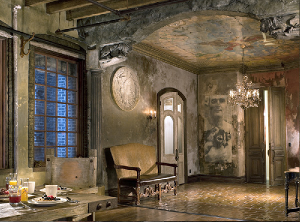
Am I the only one at ahhh with Gerard Butler’s New York Loft. I’m even ready to forgive him the Bounty Hunter. (Seriously, Gerry, don’t sell yourself cheap). But this apartment, if you can call it that, is definitely worthy of the  King Leonidas. And may be it’s not completely my cup of tea design wise, I can appreciate the quality “aged” work that so often goes sour Disneyland.

So we are talking about 3,300-square-foot loft in Chelsea, Manhattan located on 6 and 7 floors. the actor  worked with architect Alexander Gorlin and film designer Elvis Restaino for years to complete the masterpiece, and for me the time was well spent as the place looks like it’s been there forever.
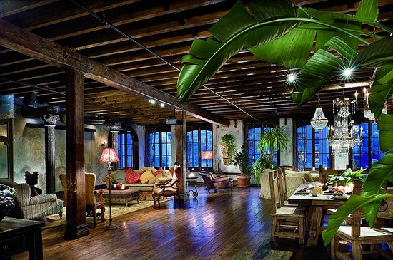
According to AD, the loft boasts, “13-foot-tall mahogany doors; a ceiling and wall frescos; plaster walls chipped and mottled with age; massive columns supporting limestone lions; crystal chandeliers casting spidery shadows,” and plenty of furnishings from New York décor mecca ABC Carpet & Home.

<images via here and here>

san francisco conduit 10 April, 2010

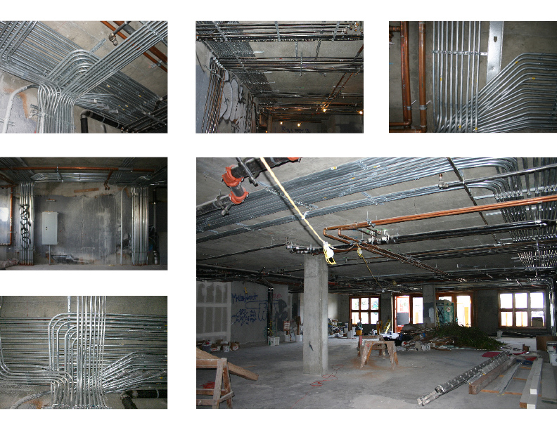
No, I’m not going to give you the tour of SF underground. Conduit is the absolutely handsome restaurant which got its name from the circumstances. When Stenley Saitowitz| Natoma Architects‘ team stepped on the ground floor of the commercial space in a new residential building, all they saw is a low ceiling and a tangled maze of plumbing, sprinkler and electrical conduits serving the residences above.
So when impossible to cover, make it to stand out. Who might have thought that galvanized and copper conduit can look so stylish and unique.  Talking about design on the budget, i bet these guys didn’t have to break the piggy bank.
<images via www.archdaily.com>

andrea joseph’s sketchbook 6 April, 2010

Thanks to the Richworks’ post on doodle art I came across an uber-talented UK artist and illustrator  Andrea Joseph. Her sketches reminded that no matter how advanced the graphic design technologies are, nothing can beat the power of the human made art. Make me feel like pulling out those colored pencils I tucked away with all this Sketchup work. The incredible personality of her sketches make me feel like I already know her. The only thing left to do is to ge the project where I could use her prints.

Visit Andrea’s blog for the endless source of inspiration and a piece of sultry British humor.

<images via www.andreajoseph24.blogspot.com>

light bulb 16 March, 2010

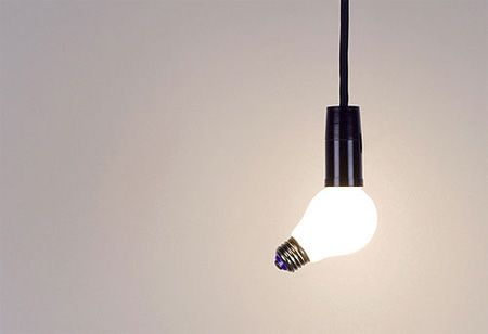
For one of my school projects we are to design a light fixture. With the abundance of contemporary lighting nowadays it seems like everything has already been invented, so I decided to stick to the basics and get my inspiration for the regular incandescent light bulb. I absolutely LOVE the shape and would it be my wish, I’d lit my hole apartment  with Edison incandescents. After browsing a little while I came across this compilation of light bulb inspired designs and found it absolutely amazing!

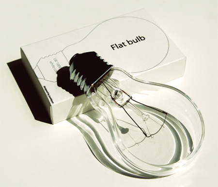
Flat Bulbs by Joonhuyn Kim have slim shape that allows them to be easily stacked and prevents breakage.

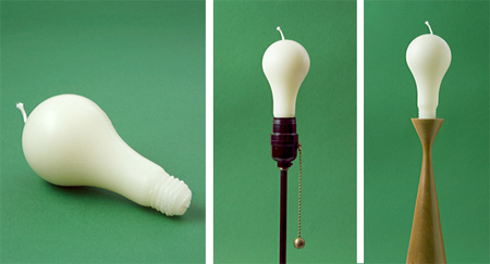
You do not need electricity for this light bulb

Creative Siamese twin bulb, with two bases and one head.

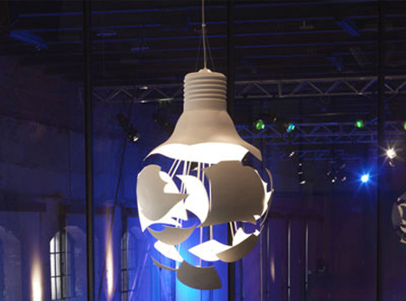
Scheisse pendant lamp shaped like a broken light bulb.

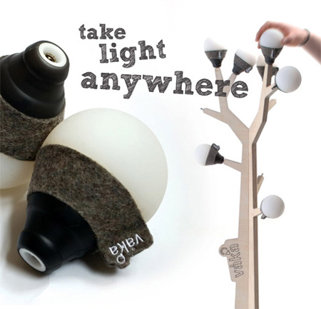
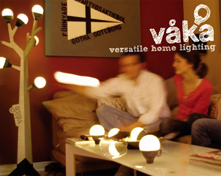
Vaka concept by Ian Bach combines a designer light tree with mobile light bulbs. The bulbs are made from silicon and are rechargeable, meaning that they can be removed from a tree and will still work.

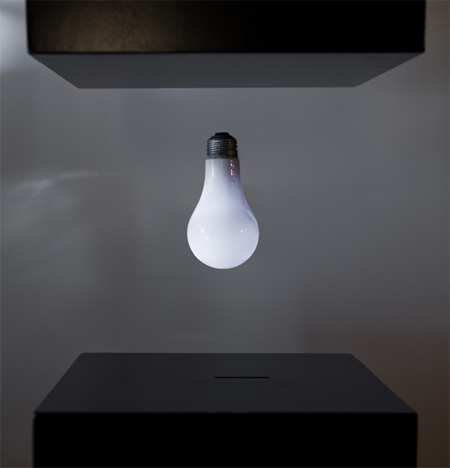
A levitating wirelessly powered lightbulb

[youtube=http://www.youtube.com/watch?v=b0JLnF9A9P0]

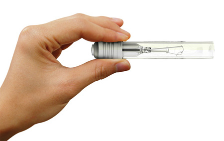
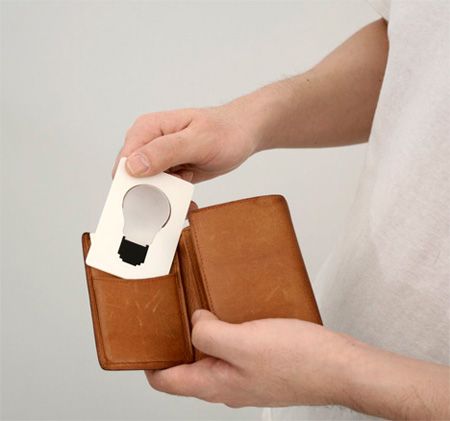
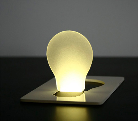
Creative Pocket Light by Hyun Jin Yoon & Eun Hak Lee.

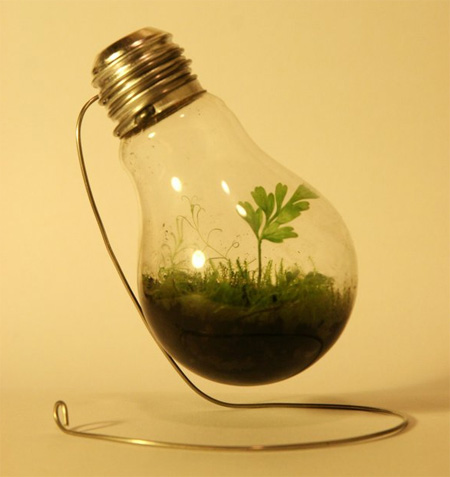
Reduce, Reuse, Recycle by Summon-The-Wolves

My absolute favorite by Ingo Maurer

<images via www.toxel.com>

the yas hotel, dubai 10 March, 2010

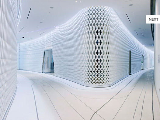
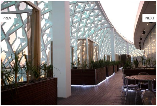
Recently I’ve really attracted to the architectural structures of curvilinear shape. The swooping curves of these spectacular structures make me pause and stare and my eyes can’t get enough of it. I got plenty of the eye candy browsing through the yet another oh-spiring Dubai structure, The Yas Hotel by Asymptote Hani Rashid + Lise Anne Couture, voted the best building of the year 2009 in the category of Hotel/Restaurant.

The Yas Hotel, a 500-room, 85,000-square-meter complex, is one of the main architectural features of the ambitious 36-billion-dollar Yas Marina development and accompanying Formula 1 raceway circuit in Abu Dhabi, UAE. Asymptote envisioned an architectural landmark embodying various key influences and inspirations ranging from the aesthetics and forms associated with speed, movement and spectacle to the artistry and geometries forming the basis of ancient Islamic art and craft traditions.

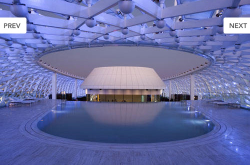
Of architectural and engineering significance is the main feature of the project’s design, a 217-meter expanse of sweeping, curvilinear forms constructed of steel and 5,800 pivoting diamond-shaped glass panels. This Grid-Shell component affords the building an architecture comprised of an atmospheric-like veil that contains two hotel towers and a link bridge constructed as a monocoque sculpted steel object passing above the Formula 1 track that makes its way through the building complex.

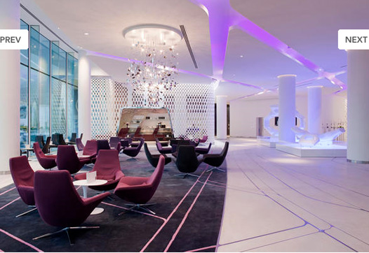
And as exited as I was to see the interiors (as I’m currently very puzzled by the integration of the interior into exterior and vice versa), only a few were up to par with the architecture. Well, it’s hard to compete with this beauty or…may be they just ran out of money:)

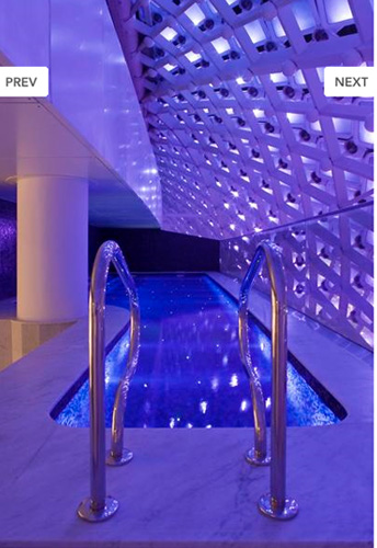
Hey, I’ll give them the best pool award hands down.

<images via www.archdaily.com and www.theyashotel.com>