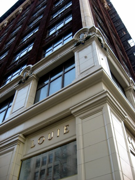
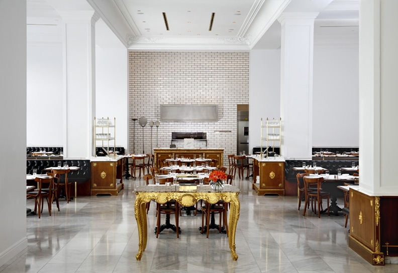
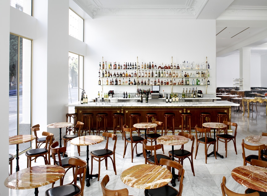
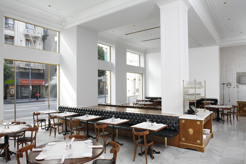
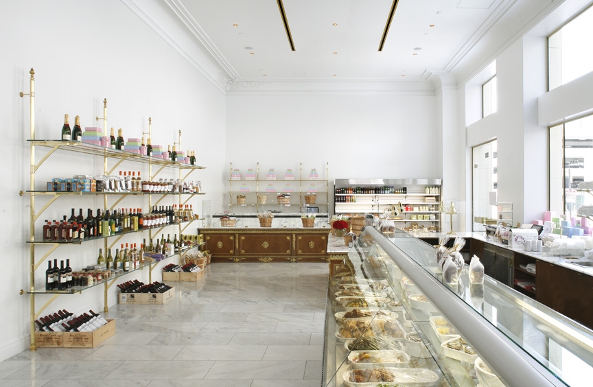
To follow up on the amazing downtown walk, we stop by for the dinner at Bottega Louie, a new hip restaurant I’ve heard a lot about all over blogosphere. And we know that the blogosphere doesn’t lie. The place was even better that I’ve imagined. Designed by View Design Studio, it already got the 2009 AIA Los Angeles Restaurant Design Award.
Combining classical architectural details, exquisite food (bot on the menu and at a little retail area) and the trendy social atmosphere, Bottega Louis definitely makes you forget that you are in LA rather you are sitting in the heart of Manhattan. Well, someone here is in the New York state of mind today.


And I seems to find the one responsible for the package design of the irresistible macaroons boxes. Those evils look SO cute and luring. Shortly, if you ever find a spare $20 you know what to get me)  <images via 1, 2, 3>
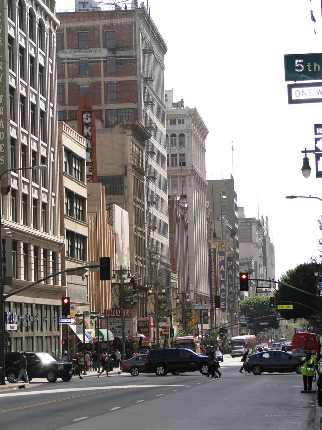
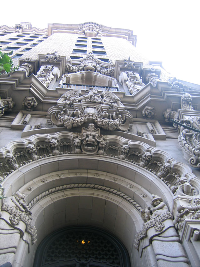
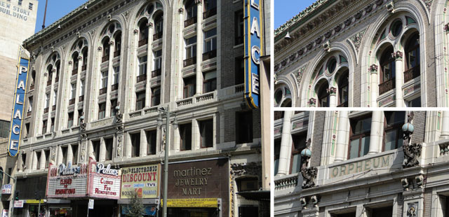
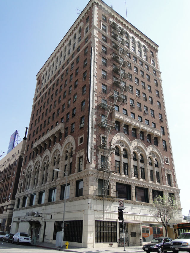
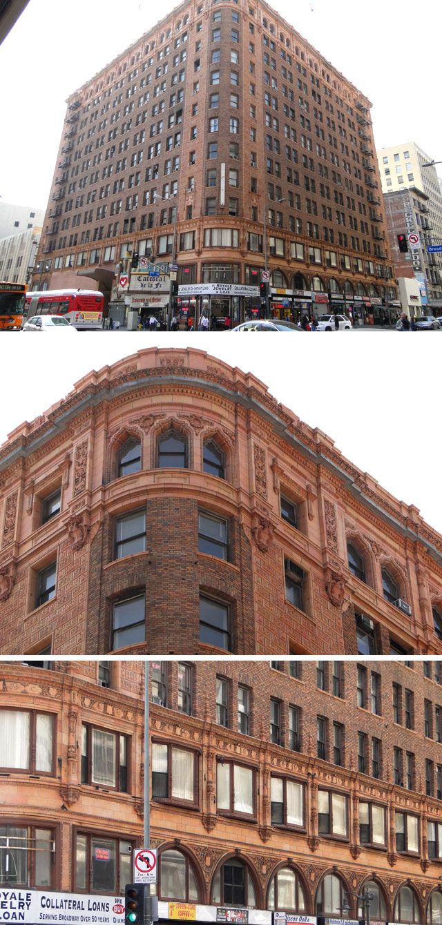
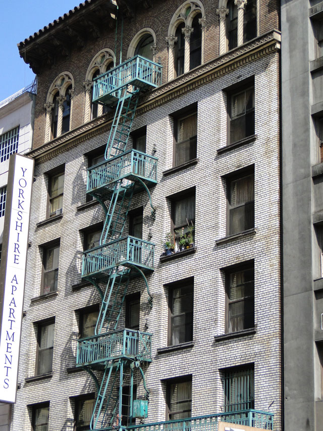
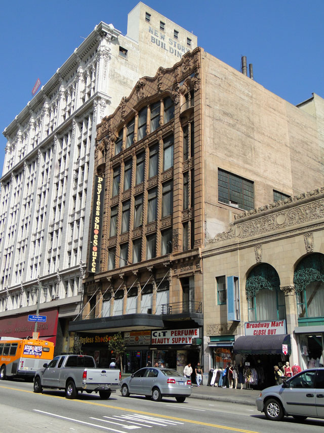
One of the past weekends, I finally managed to carve out some free time to go and explore the downtown. With the tremendous changes of the past few years, it has turned from the “scary to be” place into “to be seen in” place. Lots of trendy restaurants, clubs and cultural venues all fleeing to downtown. And so did I, equipped with a camera.

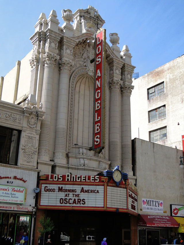
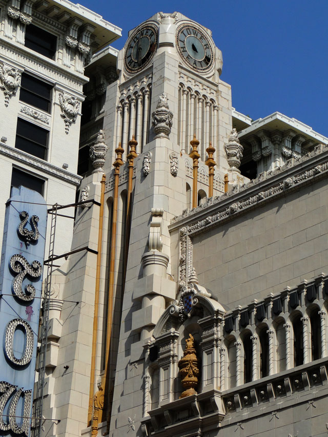
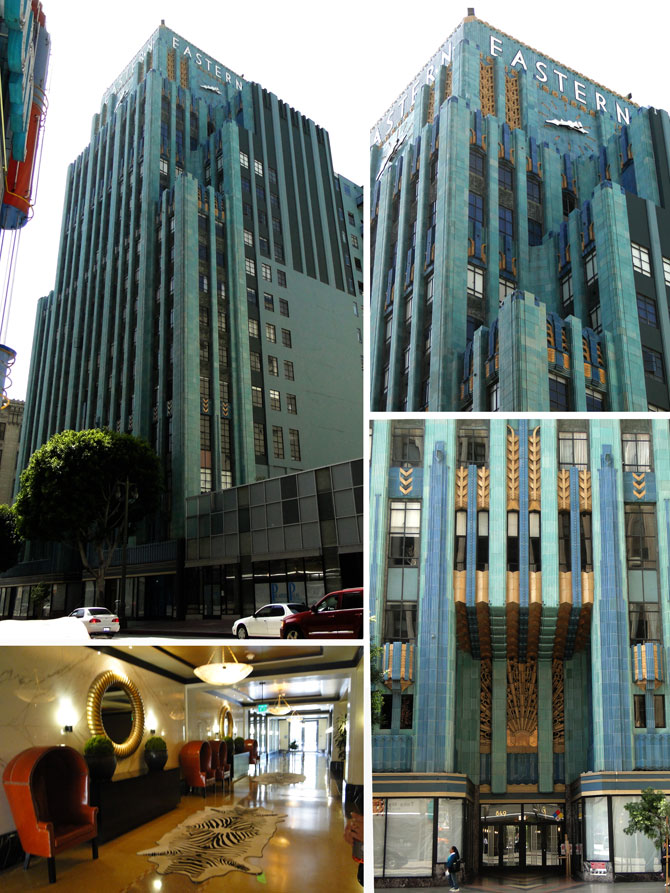
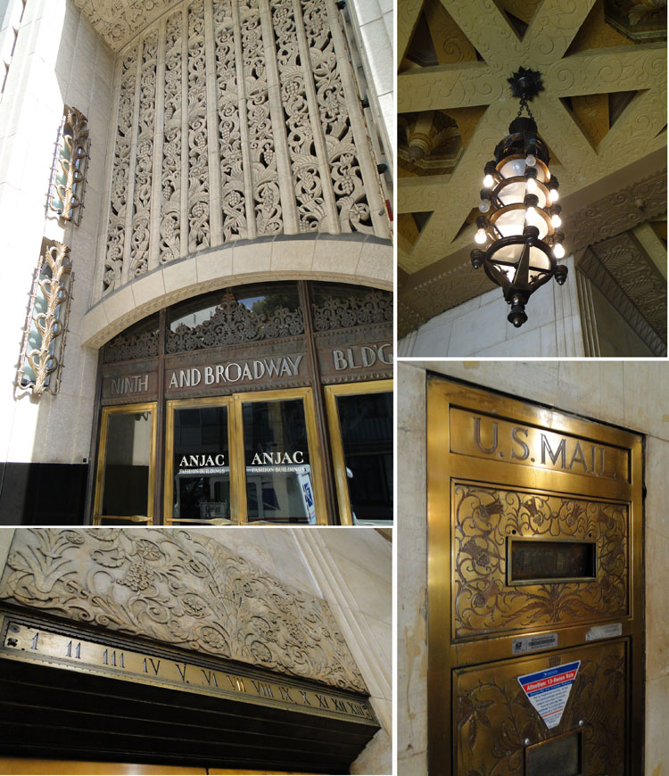
In downtown, it’s all about the details. To take the moment to stop and literally look above those hectic shops and take it in. Wish for the Golden Age of Hollywood era and see yourself strolling down Broadway for the premier of the new play in one of those gorgeous theaters. 


Oh and Art Deco, of course…

And for the piece of New York on the West Coast for those of you, like me, tearing your heart apart between the two cities.


 <images via me>
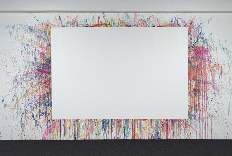
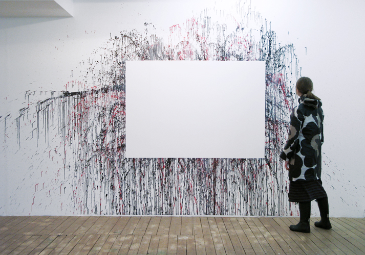
It seemed impossible to reinvent the famous Black Square by Malevich but this Norwegian artist definitely made a simple rectangle more fun. The series of art installations by Jørund Aase Falkenberg can be interpreted quite philosophically when though of the eloquent simplicity of the white space or rather playful when trying to imagine the actual piece of art that was in the place. Either way – genius!


 <images via www.jorund.com>
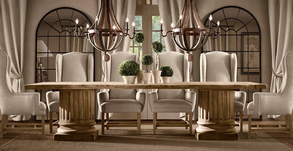
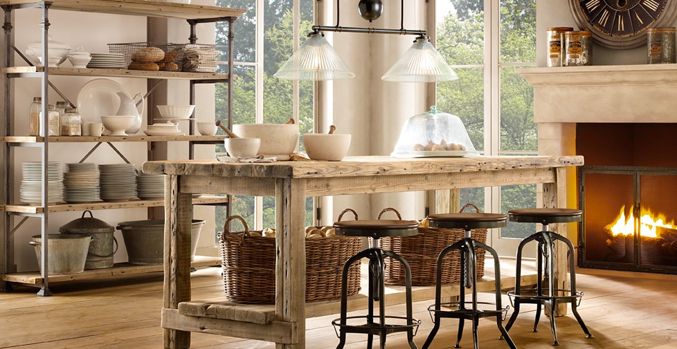
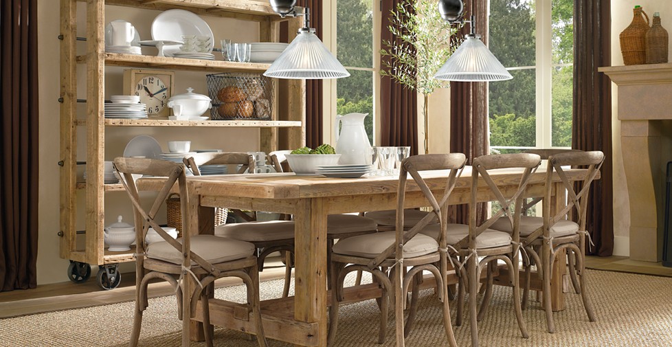
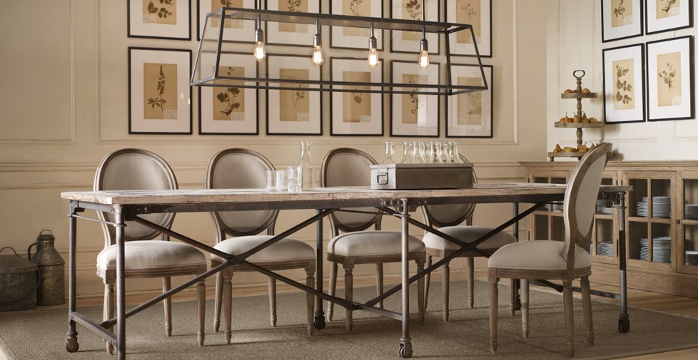
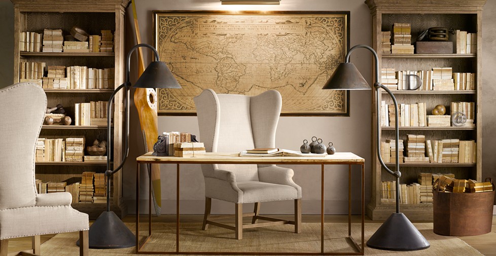
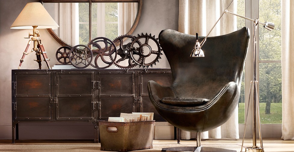
The spring collection of Restoration Hardware is really fresh and inspiring. For a while I lost RH from my view as their blue-brown color palette got, let’s be honest, jaded. I’m so glad to see them revived and back on my top list. Aged woods, natural linens and jutes, intellectual collectibles and TRUNKS…lots of trunks! What else a girl need for a pleasant summery weekend. My mind has already moved in with all these goodies into that French Old Mill House in the Town of Plaisance from the May AD issue. Stop by if you ever in the area:)


 <images via www.restorationhardware.com>
Living in a rental creates a lot of design challenges. Basically, you are stuck with the white walls, beige carpet and no architectural interest whatsoever. And even though our manager was kind enough to let me paint whatever I want, after tackling the living room the idea of repainting the whole apartment back to the lovely “Swiss white” doesn’t seems as exciting anymore. And I just happen to love bold dark colors, so I’m afraid I might need more than one coat of white when we move out.
And my husband, being genius as usual, suggested it to be my “Designer Challenge”. Literary white room. And while I don’t mind white rooms in certain cases, the problem is that’s the bedroom, the room that should be sumptuous and intimate.
I decided to start searching for bedrooms that can inspire.
to be continued…


 <images via www.decorpad.com>
 <images via 1, 2, 3>
