I picked up this blooming cherry branch at the local grocery store for $4 and couldn’t be happier this morning when enjoying it every time I pass by the dining. The scientists lately figured out (!) that happiness in life consists of little moments of being happy. This is definitely one of those.

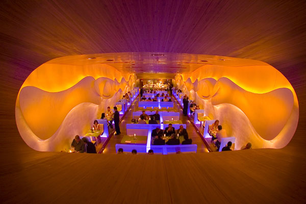
Searching for the inspiration for a new project I came across Morimoto Restaurant in Piladelphia. although it’s not at all a new project (opened in 2002, the designs still very relevant and vibrant. The space was designed by Karim Rashid, an astonishing product and space designer, who claimed the whole space with his signature style.
Rashid’s 6 foot–tall serpentine sculpture of black fiberglass marks the transition from the vestibule to the dining room, where the low bamboo ceiling ascends in a wave to a height of 20 feet. Half-height frosted boxes of plate glass act as dividers. Concealed beneath them are LED strips that set the glass softly aglow—cycling between synthetic cyan, magenta, green, orange, and lavender at a pace so slow that the shift barely registers at a conscious level. 3-D lava-lamp shapes in the bas-relief plasterwork of the sidewalls instantly warms up the space.
What a great solution for the ever-irritating problem of long and narrow spaces.

The sequel to the original Morimoto in the City of Brotherly Love, is Morimoto, New York. This two-level 13,000-square-foot spectacle represents the first Big Apple foray for both restaurateur Stephen Starr and architect Tadao Ando. At one end of the blackened-steel facade, the 50-foot-wide arched entry is draped with a fish-roe red PVC curtain. Inside, a rippling canvas-and-fiberglass ceiling, a resin-topped bar, an LED-lit wall of 17,400 half-liter plastic water bottles, and beechwood furniture by Ross Lovegrove accompany Ando’s signature concrete.


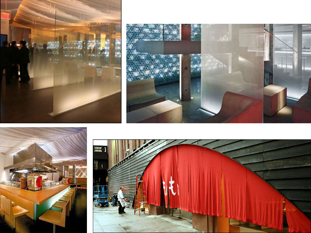
even the restrooms are fantastic.
 <images via here and here>
How would you like to take a cruise in a air-hotel?! If this design concept will come to reality, we would be able (or at least the wealthy ones) to have and amazing experience of sky cruising in a new luxurious resort.
The Aircruise is a radical new design that promises to accommodate guests in a 265-meter tall hotel that could float above city skylines or over dramatic landscapes according to its designers at Seymourpowell.
It’s not a simple plane to get from A to B as fast as possible but for those you would like to enjoy incredible city and landscapes and relax in the luxurious apartments with the breathtaking views. Too bad only 10 apartments will be available for rent.
Are you ready to slow down and enjoy ride of your lifetime?!!


Tour the Aircruise here
[youtube=http://www.youtube.com/watch?v=bP15Vgt55Gk]
<images via www.hospitalitynet.org>
Most of us here, in design blogosphere, know and love Brooke Giannetti from Velvet & Linen blog where she shares her daily design aspirations, travels and home projects in such a lively and personal way that it seems you ‘ve known her for ages. She and her multi-talented husband-architect Steve manage a successful architecture and interior design firm here in LA. She runs The Giannetti Home, an absolutely beautiful furniture and accessories store in the heart of Brentwood. And they have 3 kids!
But this is not the end. Browsing through their lovely portfolio I stumbled upon another creation of the Almighty family.
Detaliano is a website – online pattern book and visual reference library of Classic architectural elements and images, organized by architectural style and backed up by details on how to build or where to buy the element.
Here you can find all you architectural and design needs answered. Whether you browse numerous photo gallery on exterior and interior architecture (taking in the 20 years of experience!), decor, sketches, reference to basic dimensions and codes, Detaliano is a priceless resource for both designers and home owners with “what to start from” headaches.
Hey and the vendor lists are amazing! It’s like sneaking into the firm’s design library but with all the links a click away.
Thanks Brooke and Steve for being such a great inspiration for the design community.
P.S. Honestly guys how do you do all that?!
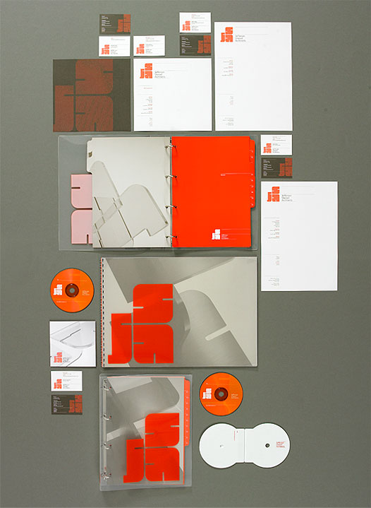
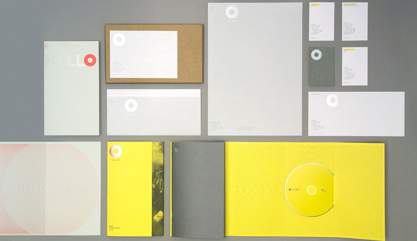
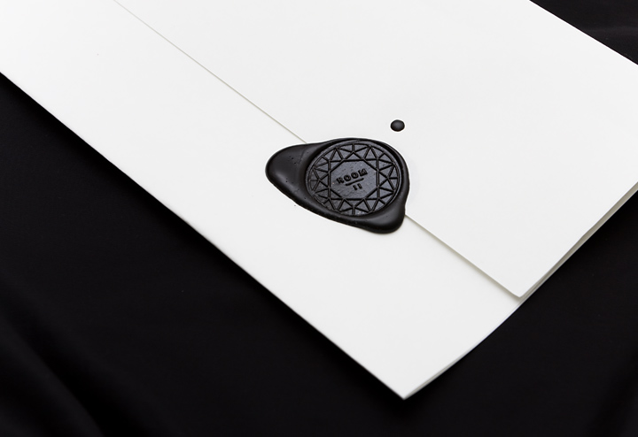
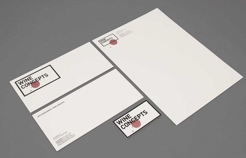
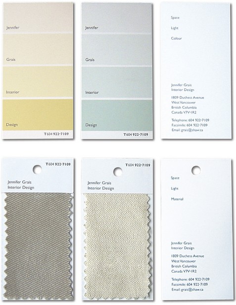
Following the Design Sponge post on Logo Design and Identity (thanks meg mateo ilasco), I browsed the www.graphic-exchange.com website and found TONS of inspiration. I don’t know about you but I’m constantly trying to reinvent my logo and, honestly, got a little too tired of it. May be I should just surrender in the hands of a professional graphic designer?! In the meanwhile, here are a few of many designs that I find very successful.



02.jpg)
fabienbarral2.jpg)
<images via www.graphic-exchange.com>


02.jpg)
fabienbarral2.jpg)