Rhode Island was my first glimpse of America 6 years ago when I came visiting with my friends for the summer. So when I saw the coverage of this all-girls-dreamy wedding in RI, I had somewhat nostalgic feelings. With an amazing scenery of bays and ocean views, RI was THE place to be during the Gilded Age of the late 19th century. And with all of the newly born New York aristocracy flocking in, there has been some magnificent architectural pieces created which we can marvel at today.
Ocean House is the one of those and is a perfect back-drop for the most special day. 
I love how stylists from TRUE Event incorporated the color palette of the building into the wedding decor, it looks so effortlessly chic and natural. Deep turquoise and citrusy yellow are so fresh and vivid together. Click here to read the full story behind this day.
 <images by Olive Juice Photography via www.stylemepretty.com>
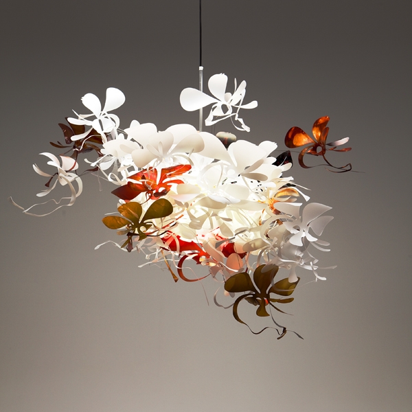
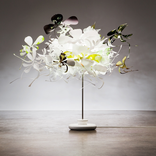
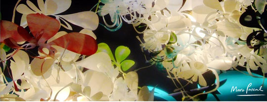
This lovely and whimsical light fixture by Australian artist Marc Pascall is so uplifting and fun. The poly carbonate orchid flower are hand-dyed by the master in multiple colorways. Available through Tabula Tua here.


 <images via here and here>
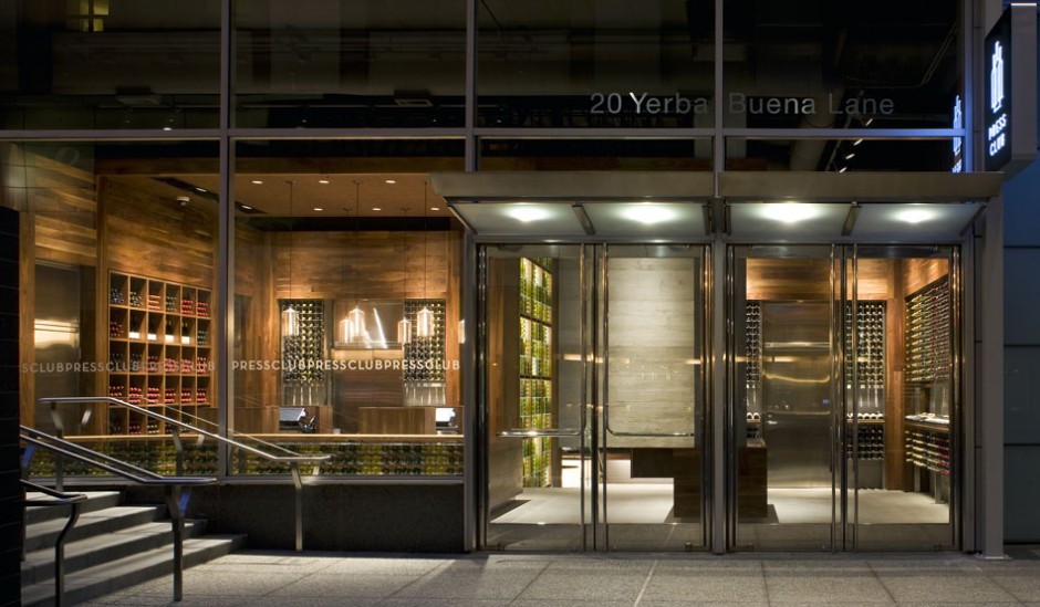
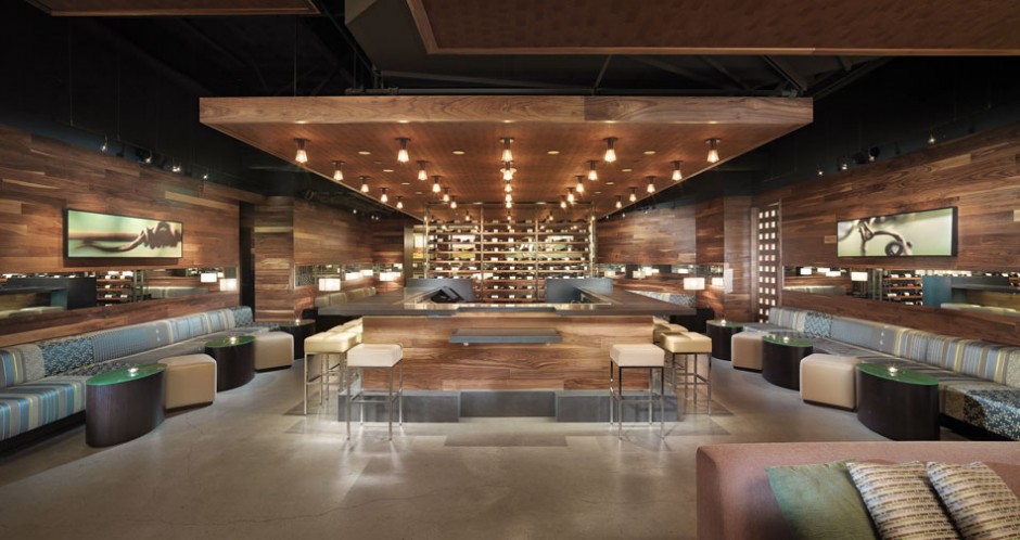
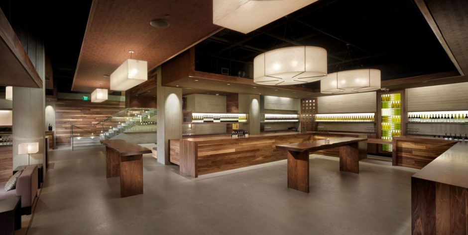
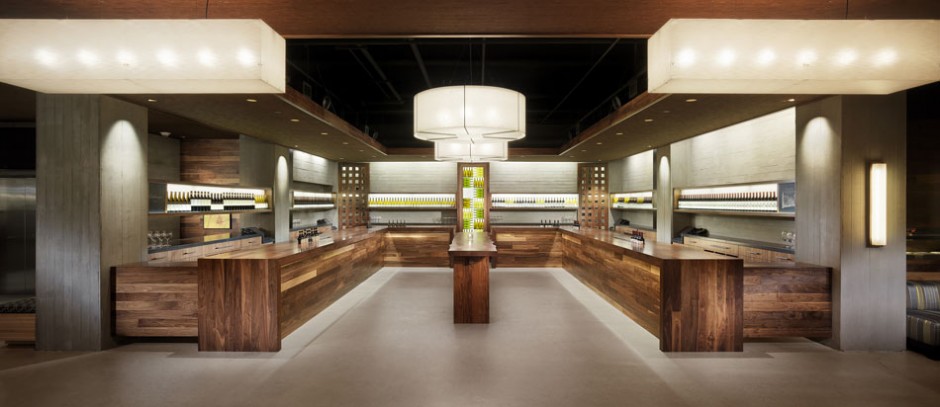
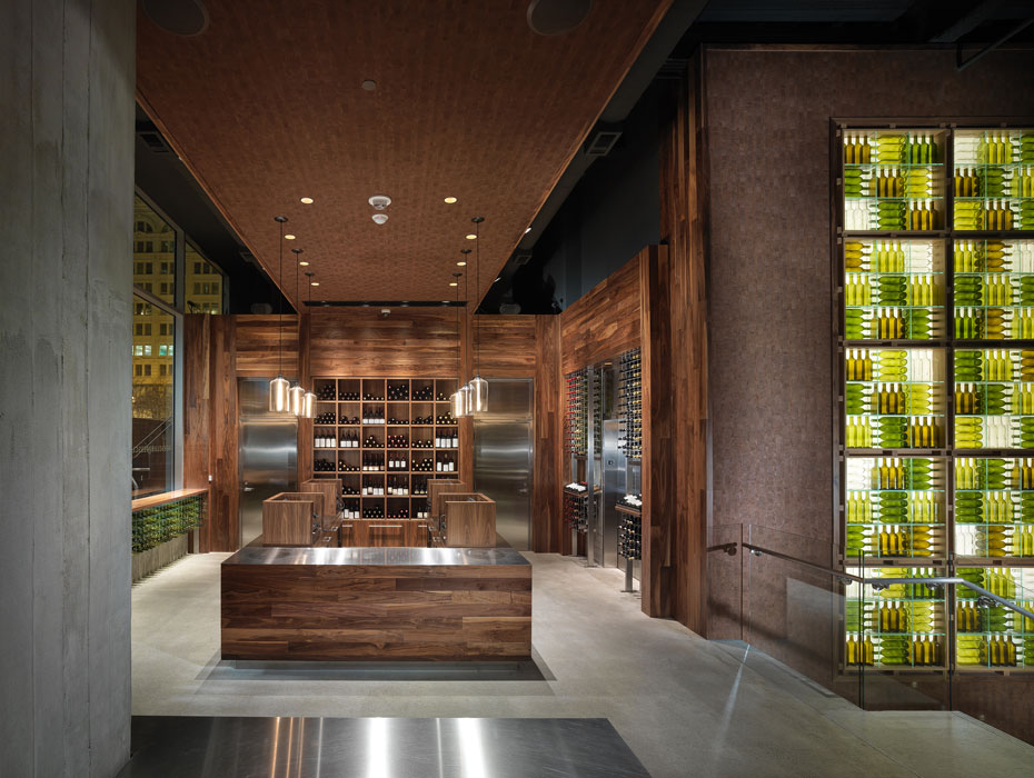
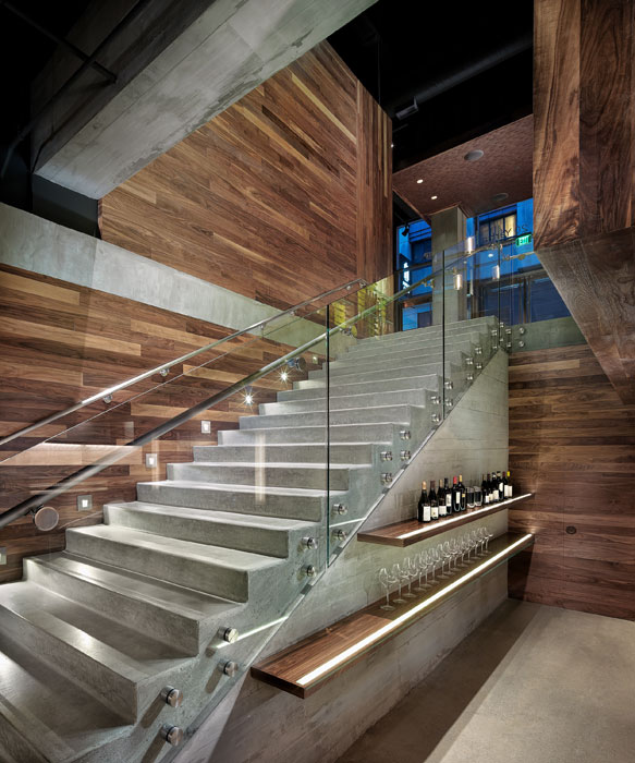
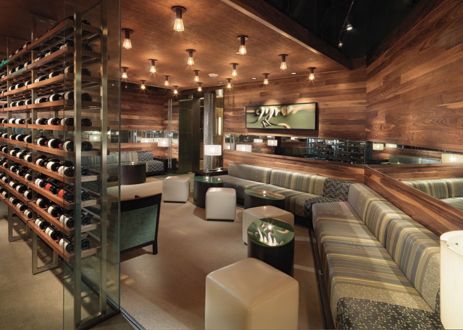
Warm autumn days makes me what to put my boots on and visit the countryside. So it happens that in California the countryside is most likely to include a winery or two. I love little wineries with their perfect design simplicity, stained rustic wood and succinct decor (mostly including wine bottles only). When I came across The Press Club, San Francisco wine tasting room and shop, I gasped at how ideally BCV Architects translated all that we love about country wine tasting into urban surrounding.
Perfect Recipe:
Laconic Architecture – check
Wood (lots of wood) – check
Bottle Decor – CHECK!


The 9,000 sf venue is located within San Francisco’s Four Seasons hotel on Yerba Buena Lane. The 1,100 SF entry level shop entices the visitor inside, and then reveals a grand stair to a subterranean level tasting lounge. The palette of materials mixes warm, sustainably sourced woods with exposed structural elements, suggesting the partnership of the organic and the industrial that is the hallmark of Wine Country. Wine bottles themselves are used in innovative displays that bring color and light to the space.


 <images via www.contemporist.com>
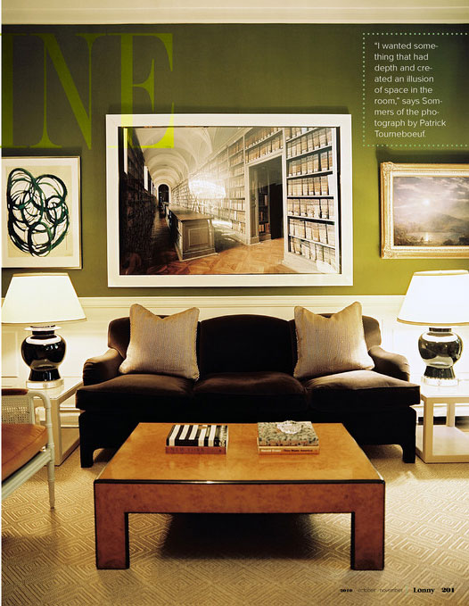
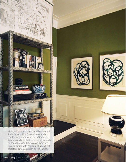
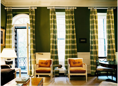
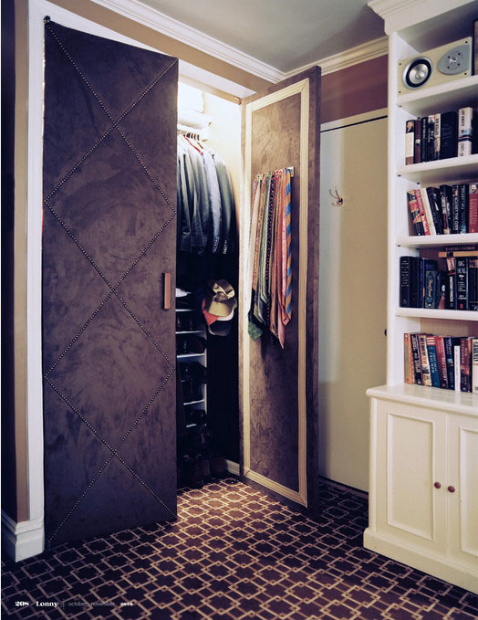
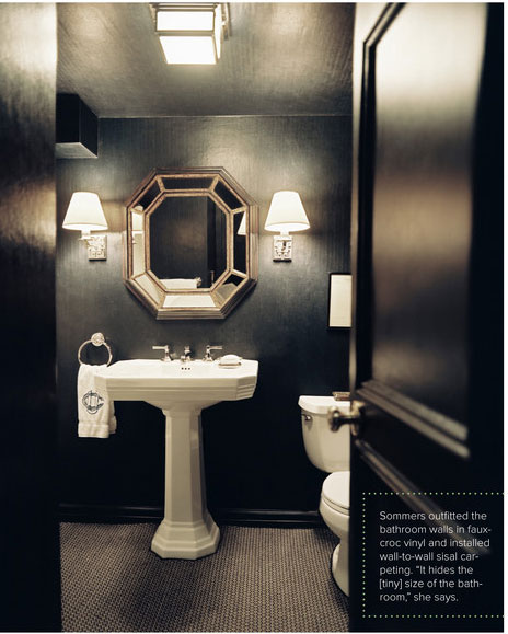
Tuesday is now my official day off. After an intense week, I decided to give myself a break and do NOTHING for a change: watch “Roman Holidays”, catch up on blog-reading and magazine-flipping. And I’ll do a LAZY post today. Since my friend scored a position of the project manager for the lovely Ruthie Sommers (Dana, I hope you are cool with me bragging on your part!) , it brought me back to Sommers’ latest project featured in the Lonny Magazine. I just loooove the richness of the green against white.


 <images via www.lonnymag.com>
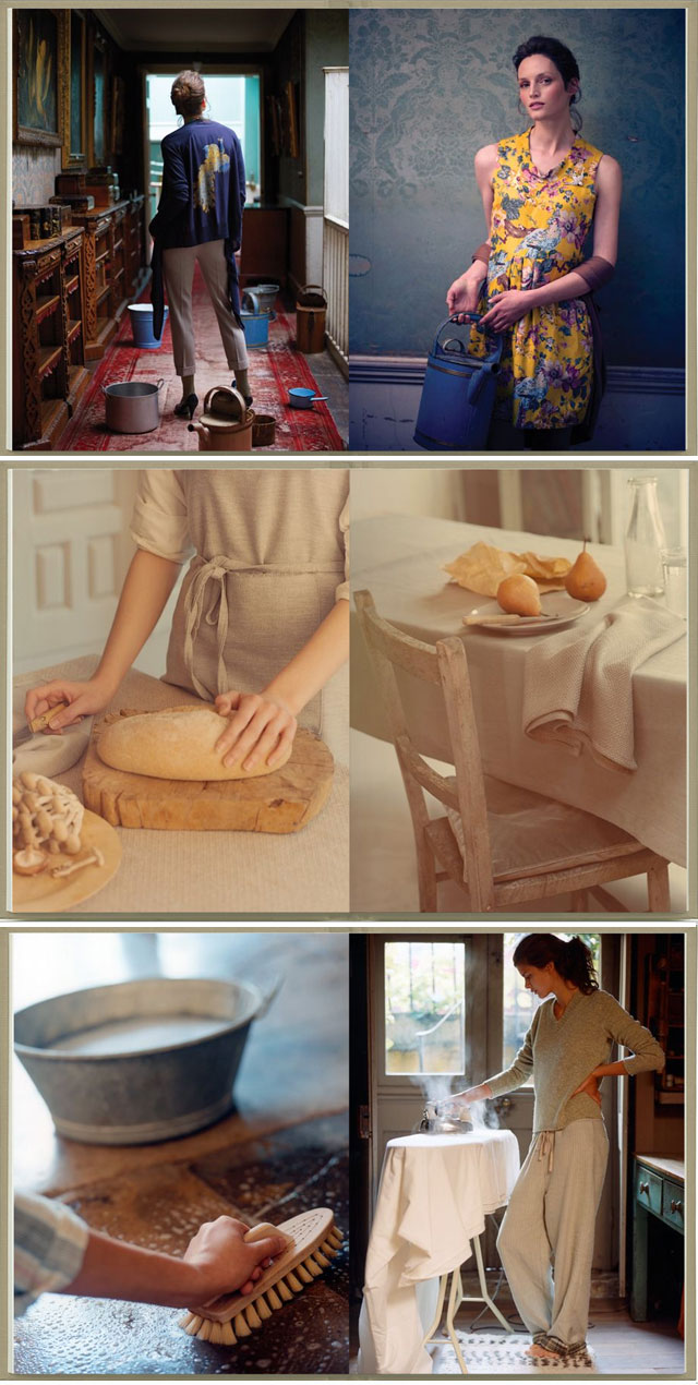
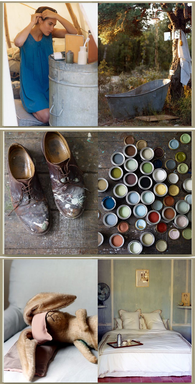
It’s gloomy in LA today but at least the weather helps to get into “get-things-done” mode. It’s so much harder with bright sun shine luring you outdoors. My to-do list made me think of the stunning Brit stylist Twig Hutchinson who made the house chores look so incredibly chic.

Which in its turn made me remember that all the real pleasures in life lay in the simple moments like this. And if you go through the day with the happy smile and appreciation for what you’ve got, it makes it so much easier. Enjoy your weekend whatever it holds in store for you.

 <images via www.twighutchinson.com>

 <images by Olive Juice Photography via www.stylemepretty.com>
