commercial

the old new: polka dot ceiling lights 5 May, 2010

It’s been a while since my last public copycat unveil but this is a good one. Flipping though last issue of Conde Nast Traveler I had one of those deja vu experiences with the ceiling lights by Marcel Breuer now found in Buenos Aires.Check out by yourself and don’t forget to VOTE for your favorite at the end.

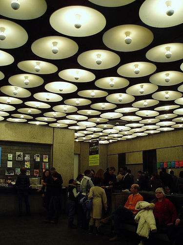
THE OLD:  Whitney Museum, NY by Marcel Breuer, 1966

Breuer’s bold gestures doesn’t end with the massive stepping exterior of the museum, but continues into the hall with the very architectural yet simple lighting decision.

On the black ceiling surface the series of the pendants looks more like the recessed concaves. The interplay of the positive and negative spaces really fools the eye.
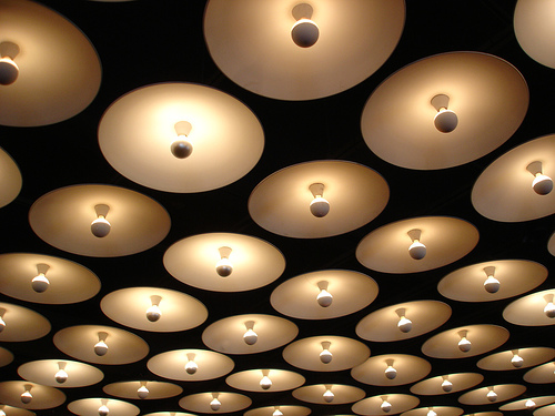
THE NEW: Isabel Bar, Buenos Aires by “Have no idea who…searched all through Internet”, 200?

This new “to be seen” spot is located next door from the celeb’s favorite dining spot Casa Cruz in Palermo. The menu of drinks changes hourly, so it’ll get you from “hangover” all through steamy Palermo night, with the loud upbeat house and glitzy dressed crowd. Waiters sell “Isabelinas”, casino-type chips used at the bar as scrip. Jeez..if only Breuer knew…
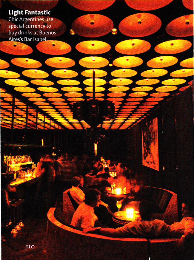
I apologize for the picture quality, had to scan from the magazine.
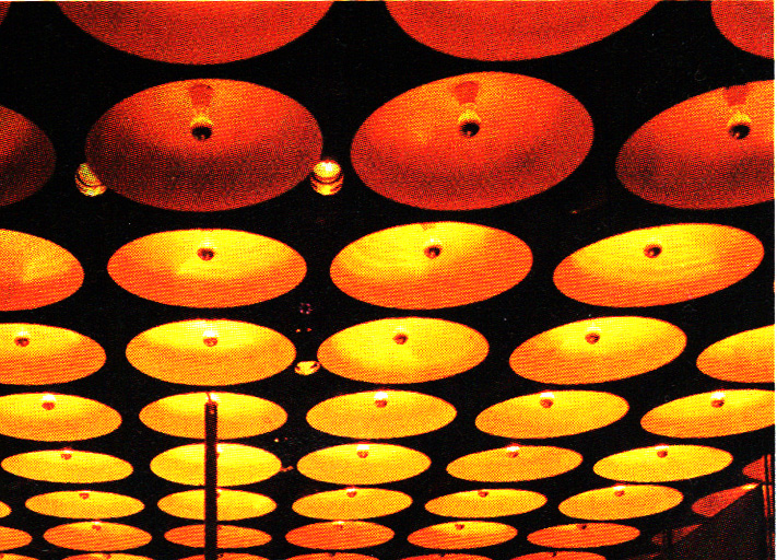
So which one is your favorite?


<images via 1, 2, Conde Nast Traveler>

l’arc paris restaurant and club 20 April, 2010

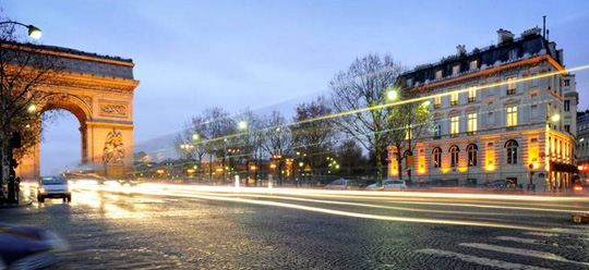
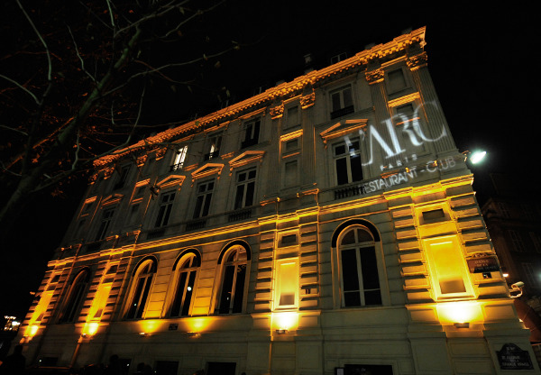
I’m always excited to see places that house contemporary interior in a historic building. What a great designer challenge. How do you show appreciation for the space heritage and create funky atmosphere without period touch? And especially if the historic building faces nothing less than Arc de Triomph in Paris.

Well, Prospect Design have solved this dilemma quite successfully.

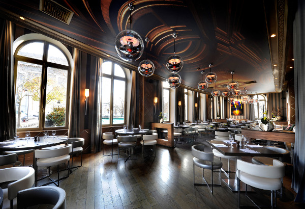
I absolutely amazed by the ceiling of the main dining area. The abstract collage of the classical moldings so accurately translates the concept. With the right touches of glitz and glamor (look and the reflective pendant balls and gilded suede frames of the mirrors…yum!) the place scream PARIS.

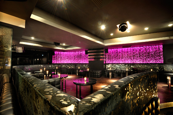
The night club on the bottom floor continues the same sleek modern design although too neon-y for my taste. I found a few pictures in a “normal” lighting.

You see what I’m talking about? Neon Rainbow (on the pic below) just killing it, don’t you agree? <images via www.prospect-design.com>

san francisco conduit 10 April, 2010

No, I’m not going to give you the tour of SF underground. Conduit is the absolutely handsome restaurant which got its name from the circumstances. When Stenley Saitowitz| Natoma Architects‘ team stepped on the ground floor of the commercial space in a new residential building, all they saw is a low ceiling and a tangled maze of plumbing, sprinkler and electrical conduits serving the residences above.

So when impossible to cover, make it to stand out. Who might have thought that galvanized and copper conduit can look so stylish and unique.  Talking about design on the budget, i bet these guys didn’t have to break the piggy bank.

<images via www.archdaily.com>