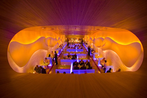
Searching for the inspiration for a new project I came across Morimoto Restaurant in Piladelphia. although it’s not at all a new project (opened in 2002, the designs still very relevant and vibrant. The space was designed by Karim Rashid, an astonishing product and space designer, who claimed the whole space with his signature style.
Rashid’s 6 foot–tall serpentine sculpture of black fiberglass marks the transition from the vestibule to the dining room, where the low bamboo ceiling ascends in a wave to a height of 20 feet. Half-height frosted boxes of plate glass act as dividers. Concealed beneath them are LED strips that set the glass softly aglow—cycling between synthetic cyan, magenta, green, orange, and lavender at a pace so slow that the shift barely registers at a conscious level. 3-D lava-lamp shapes in the bas-relief plasterwork of the sidewalls instantly warms up the space.
What a great solution for the ever-irritating problem of long and narrow spaces.
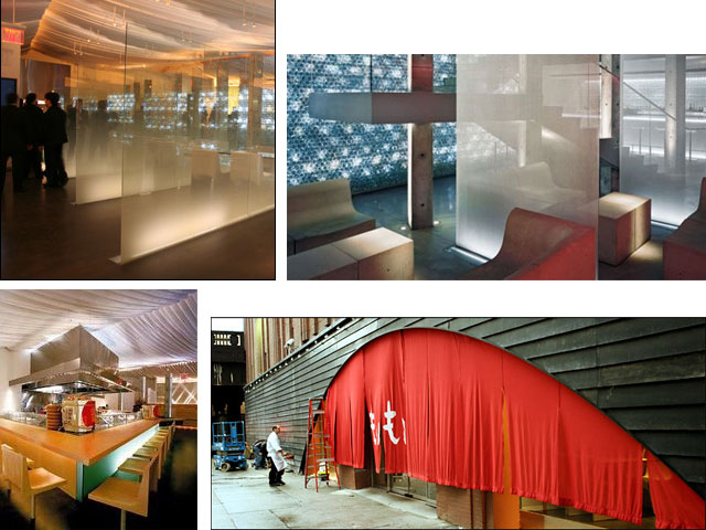
The sequel to the original Morimoto in the City of Brotherly Love, is Morimoto, New York. This two-level 13,000-square-foot spectacle represents the first Big Apple foray for both restaurateur Stephen Starr and architect Tadao Ando. At one end of the blackened-steel facade, the 50-foot-wide arched entry is draped with a fish-roe red PVC curtain. Inside, a rippling canvas-and-fiberglass ceiling, a resin-topped bar, an LED-lit wall of 17,400 half-liter plastic water bottles, and beechwood furniture by Ross Lovegrove accompany Ando’s signature concrete.
even the restrooms are fantastic.


Pingback: magic bulb trick « Design Apothecary
Such an amazing interior! :) I intend to refer to it in my Personal study this year for my deisgn course. Brilliant photographs!
Good luck in your design studies. So much fun!