design fix

design fix: yarn wreath 19 December, 2010

My ultimate rainy day recipe is finishing all of you DIYs  (that you’ve been putting away till a rainy day) and watching old classics.  Taking into consideration that it’s been raining non-stop for 3 days already, I did just that.sometimes I think we had more rainy days here in LA, I would have been a more productive person overall :)

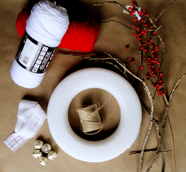
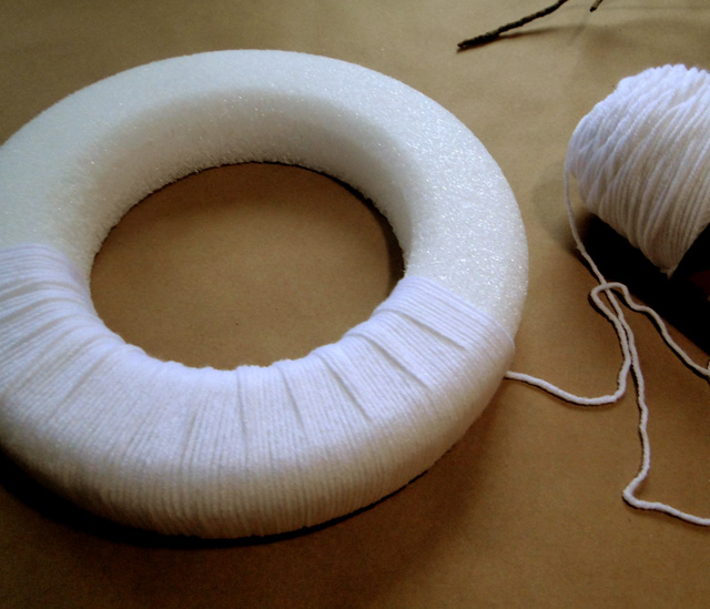
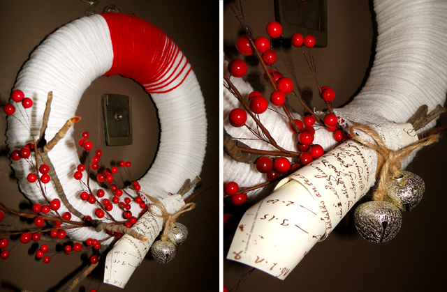
I’ve been wanting to do a yarn wreath for quite a while now so yesterday I finally sat down to do it over Funny Girl.

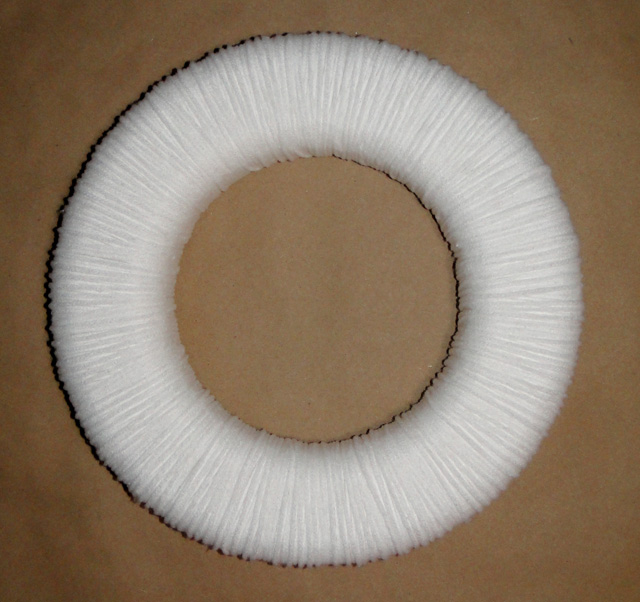
it started slowly… about hour and a half later,

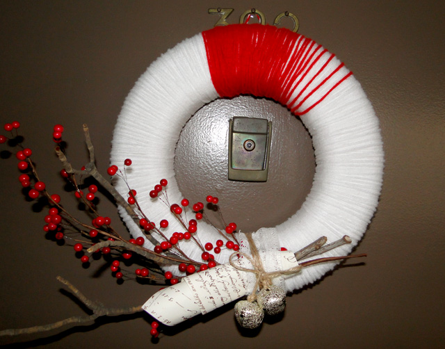
I just LOVE the final result! What are you doing on your rainy/snowy days?


<images via design apothecary>

yarn wreaths 12 December, 2010

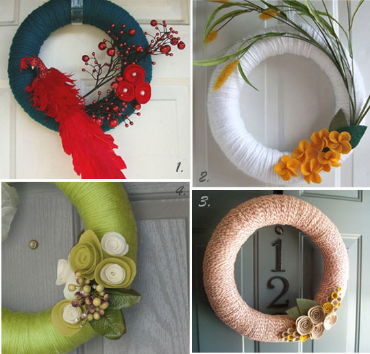
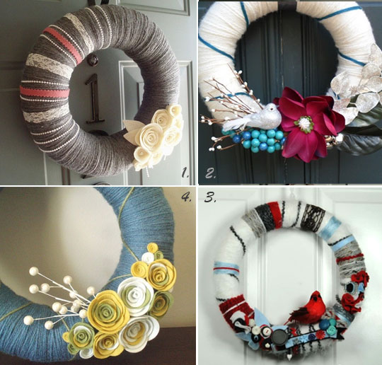
I’ve been in a crafty mood lately and I totally see a DIY project coming. What would it be? a yarn wreath, of course. I got so tired of the traditional tree branches look, and the yarn wreaths are so versatile – you can make them sleek and contemporary or go way out with ornaments, feathers and what not. And they are SO easy to do yourself too. Here are a few of my favorites from Etsy.

1, 2, 3, 4.

1, 2, 3, 4.

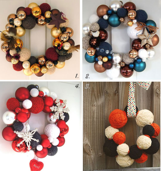
And how cute are these yarn balls, such a great contrast with shiny ornaments. 1, 2, 3, 4

design fix: wall stripes 29 April, 2010

As promised I’m reviling one more DIY transformation of my apartment for the latest party weekend.  As a regular married couple we also have the TV discussions. And although we haven’t bought it yet (it’s been a year now!), the question of where to place it has been raised several times. Of course, my husband wants to put it on the pedestal in the most prominent place in the room and to be honest, we don’t have that much choice. So my challenge was how to visually divert the eye from this monster in the room and have the TV to be the last thing people will notice. I needed a statement!

So here what I came  up with.

BEFORE: Regular white rental wall got painted in “Russian Blue”. Yes, I’ve selected the color by its name:)

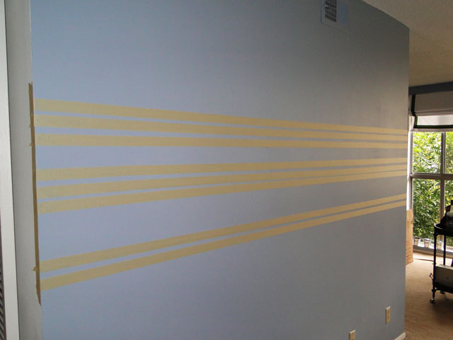
Then I taped off irregular width stripes and primed the surface of the stripes with Acrylic Medium Gel, that way the edges come out very crisp and precise.
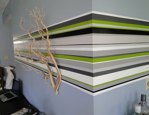
The fun part began. I used white, green, black and 3 tones of gray, all of which are left overs from previous projects.
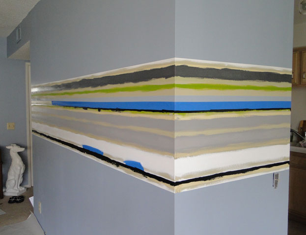
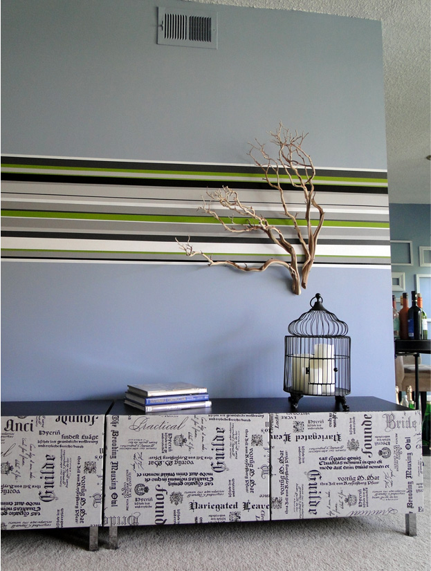
After 2 days of re-taping, re-priming and painting again, the result was quite a statement which I was looking for. I bought two Manzanita Branches and nailed them to bring in the element of nature.
As for the rest, I got two TV stands form Ikea (yes, I know… designers use Ikea too) and upholstered the doors in this amazing linen with printed fonts. I was looking for this fabric everywhere and finally found it in F&S Fabrics (Thanks Maison 21). Now, as the set is done, I’m ready for the arrival of the TV in our house.
<images via me>

design fix: side tables 27 April, 2010

Hosting a party is a true stimulus for the progress of your long forgotten DIY projects. That’s what happened to me last week, as you might have noticed with the lack of posts. Hosting my mother-in-law birthday pushed me to finally take out those paints, masking tape, sewing machine and what not. Everybody wanted to  see “the interior designer”‘s house. All of those in the industry know, that the real ID-er house looks more like a mess or a bunch of unfinished projects rather than the picture perfect dream come true.

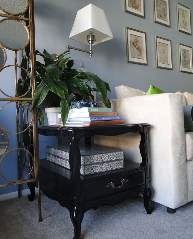
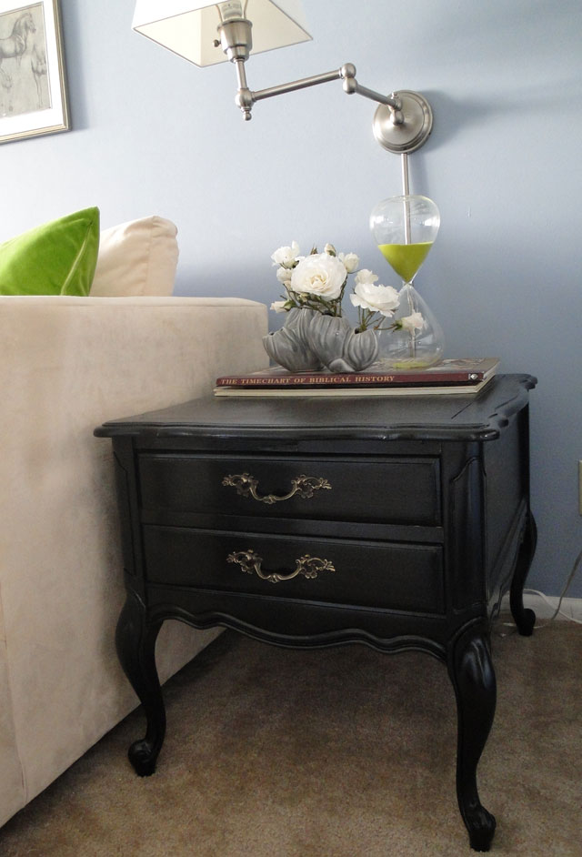
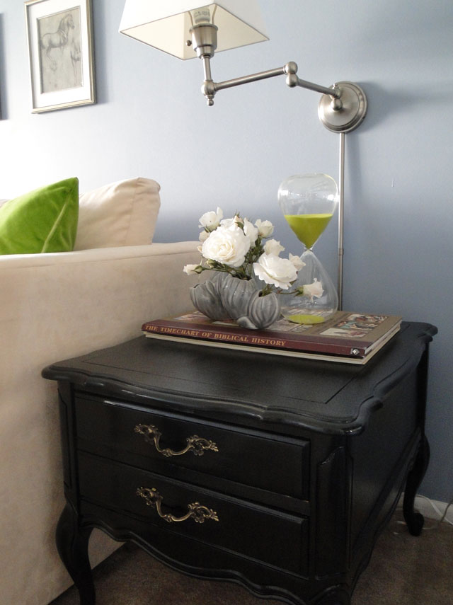
Anyways, I decided to reveal a few TLC projects that were both wallet-friendly and actually quite fun to do. Although I redid these side tables quite a while ago, I just never had a chance to take a good picture of them. So here we go.

BEFORE: I got these pieces on the brink of being thrown away in rather miserable condition. I really liked the solid frame and the fact that they are not completely the same. 

AFTER: Half of the quarter of black high-gloss paint did wonders.

<images via me>

magic bulb trick 17 March, 2010

Following my yesterday’s post on light bulb inspiration, it’s time to show my creation. I was really captured by the idea of light shimmering in the water, especially after seeing the plastic water bottles wall in the Morimoto restaurant, when lit from behind, it’s the coolest thing I’ve ever seen.

My original idea was to fill up bulbs with water and some how arrange them around the light source. But the my husband showed me the magic bulb trick on youtube and the light bulb inside my head went on! If I don’t need any wires to supply the bulb why don’t I…well, check it out.

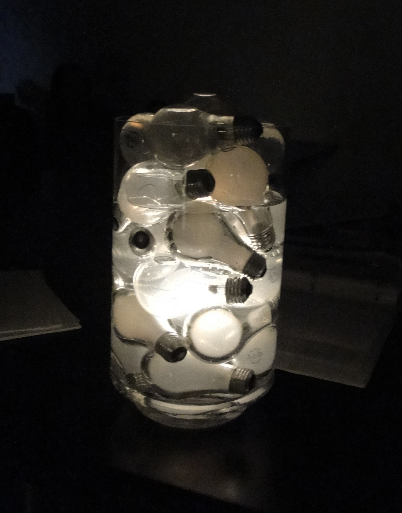
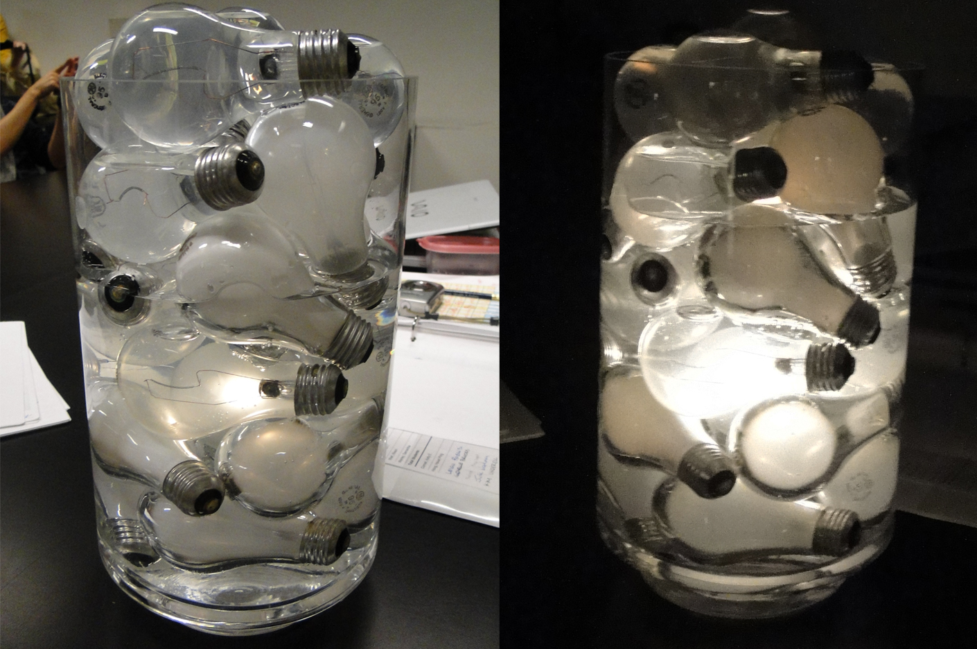
…yes, I submerged my whole fixture under the water. Not only the light looks surreal under water, but also the regular frosted bulbs appear as if the glass is a kind of liquid steel (like the bad guy from the  old Terminator movie). How did I do it?

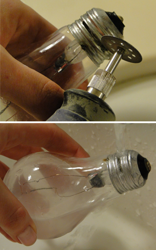
First, drilled the holes in a few bulbs and filled them up with water. These would serve as the weight for the rest of the bulbs to actually stay under water and do not float up.

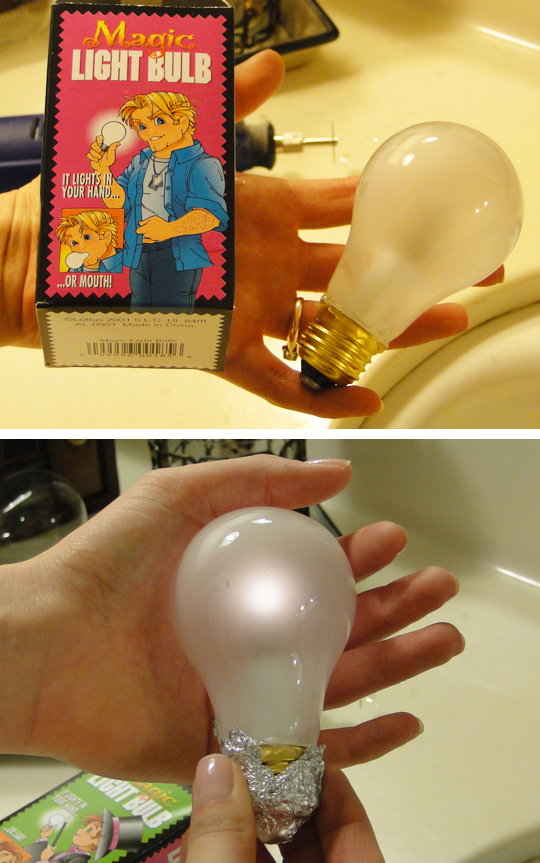
Then, I took 2 magic bulb (bought them at the local magic shop) and wrapped the base in foil to lit them up.I’ve put some hot glue around the base where it touches the glass to make sure that water is not leaking through.

And I assembled the whole thing. too bad the battery life of the magic bulb is not that long, so by the end of the show one bulb went off.

<images via me>